Animate an Illustration
How do you add animation to an existing illustration? It's a common motion design brief, but it can be easy to get carried away with the delights of After Effects and lose the integrity of the original illustration.
So today, I'm going to walk you through the process of animating an illustration. We'll look at:
- how to choose what to animate
- how to prepare the illustration in Photoshop
- how to animate the illustration in After Effects, choosing your effects wisely
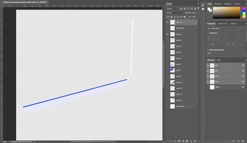
Let's start by opening the illustration in Photoshop. This is what we see:

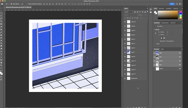

It's a beautiful drawing, but it's not optimized at all for animation, which is quite common. However, luckily we do have some layers to work with.
When you get an illustration to work on, you want to start by looking at it for inspiration rather than coming up with your own ideas and forcing them into the illustration.
In this instance, there's a tonal blue that to me really said "twilight", and there are some shadows that are always a fun thing to play with to show the passing of time. So to me it made sense that this animation would use those shadows to show night falling, and then it could build into a story where the light turns on and you can add something new to this illustration.
"You've already got a beautiful illustration, and you're just looking to enhance what's already there. So don't get carried away trying to add bits that don't fit—just work with what you've got, and it'll all come together naturally."
Get Seriously Creative With Envato Elements
Struggling for a spark? Fire up the largest unlimited creative subscription in the world. Find and download authentic graphics, templates, photos, and fonts. Get seriously creative and go supernova with Envato Elements.
Preparing Artwork in Photoshop
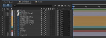
The first thing we need to do in Photoshop is to see what's on each layer and give the layers useful names. It's also helpful to merge some layers that contain similar elements.

In some cases, we'll also need to take elements out of a layer and put them on a separate layer so that we can animate them separately. To do that, select the elements you want and hit Command-Shift-J to move them to a new layer.
Now we just continue layer by layer, organizing the Photoshop file so that the layers make sense and are properly named. This can be a bit of a tedious process, but it is all worth it in the end. The other good thing is that we don't have to get it perfect because Photoshop will keep live updating to After Effects, so we can get it pretty close now, and then as we move things in After Effects, later we can go back and refine the Photoshop file.
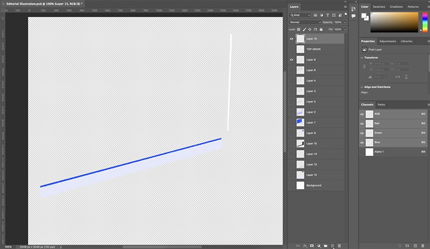
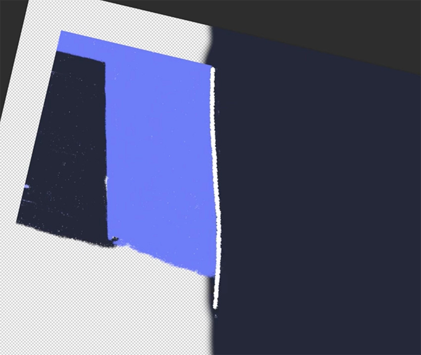
We'll also need to recreate and extend some elements so that we can animate them without exposing gaps in the illustration. For example, I'm going to redraw the white line under the door and extend the dark blue background underneath it.


I'm using a brush that's similar to the one in the original drawing, so that we get the same grainy effect. You can find lots of brushes within Photoshop, or download even more from Envato Elements.
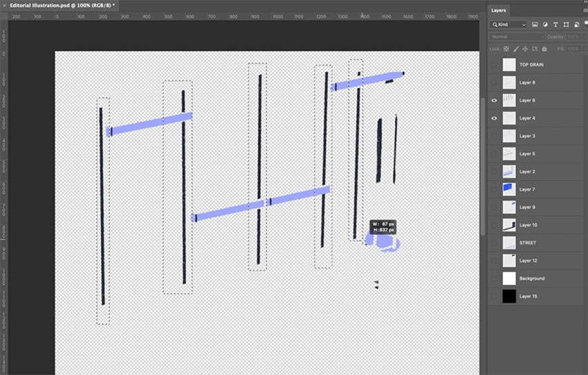
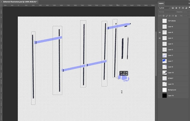
When you've finished preparing the Photoshop file, you should end up with something like this:
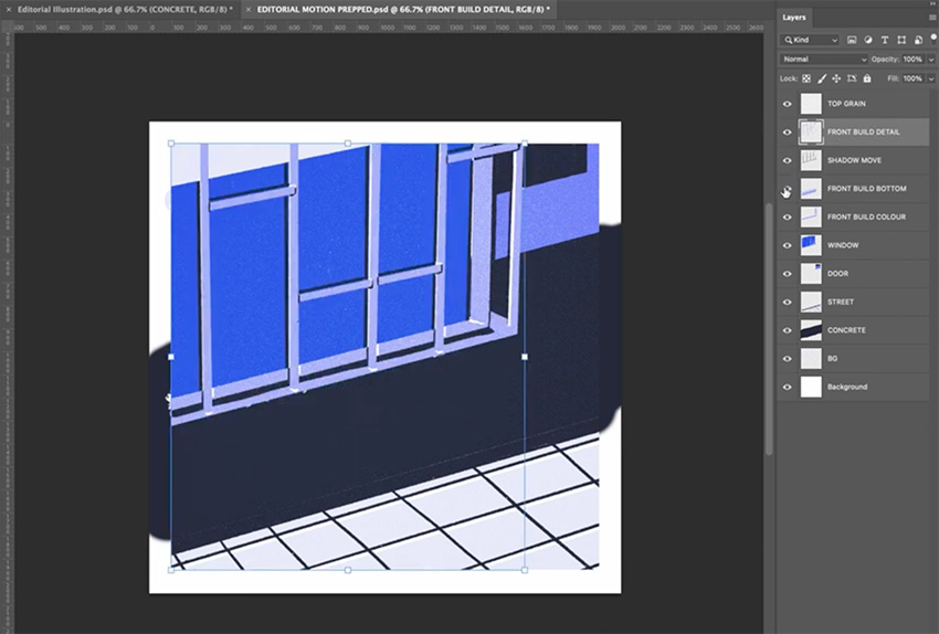


We've got everything properly layered and named for easy reference, and this will make it much easier when we go into After Effects. So save a copy of your Photoshop file, and let's go into After Effects next.
Preparing Artwork in After Effects
We're ready to get into After Effects now. So just drag your Photoshop file into After Effects to import it. Be sure to choose Composition in the dialog window that comes up; if you bring it in as "Footage", you'll lose all those layers we just created.
To stay organized, it's a good idea to create folders for your work as follows:
- _ASSETS
- _MAIN COMP
- _SUB COMPS
We'll work on the MAIN COMP, but you can keep the Photoshop file with all those layers in the ASSETS folder.
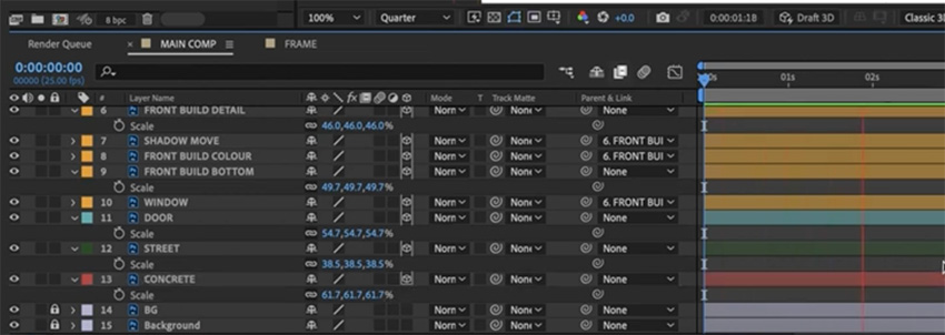
You'll see that we have the layers down at the bottom in our MAIN COMP.

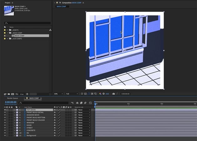

The first thing we're going to do is look at our composition settings. Go to Composition > Composition Settings. We'll make the size 1080 px by 1080 px, keep the frame rate at 25, and change the duration to 10 seconds.
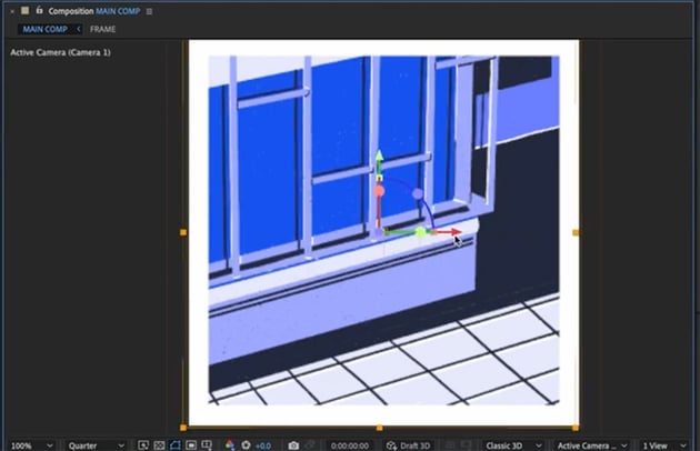
Back in the MAIN COMP window, things might look too big now, but you can fix that easily: right-click > Transform > Fit to Comp.
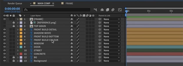
One more thing we'll do now is bring in the reference image and set it as a guide layer (right-click > Guide Layer) so that it doesn't show up in our renders. And we'll create a white frame to keep the edges clean: create two white solids, scale one to 90%, and precompose them.
We'll also precompose and lock the grain layer, and we'll color code our layers to make them easier to identify as we work on the animation. We'll also parent some of the other building layers to the FRONT BUILD DETAIL layer, so that they all move together.

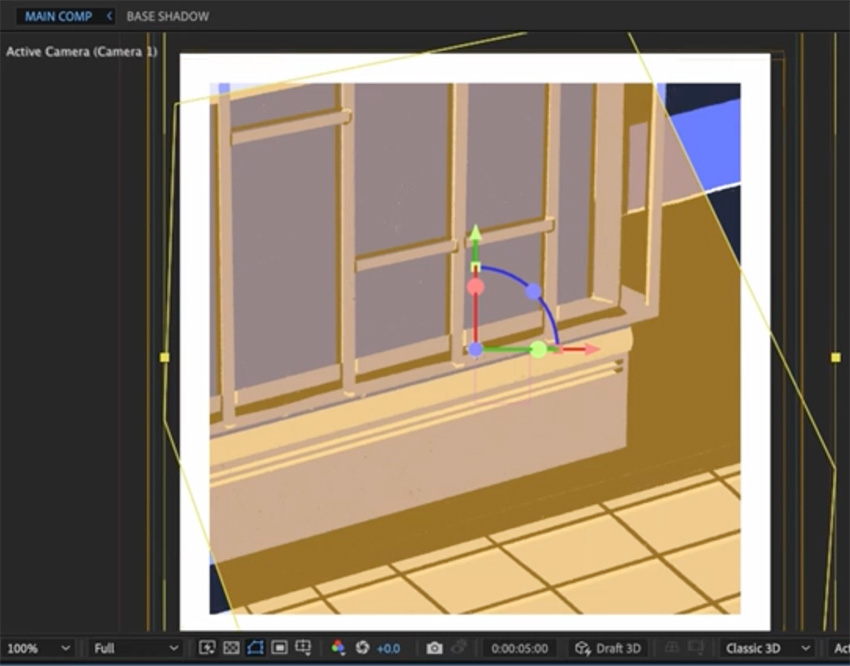
Adding a Camera in After Effects
We've done a lot of preparation, so now it's time to start animating. Overall, we're going for subtlety—we don't need any flashy camera moves, but a nice scale effect will work well.
So let's add a new camera to the scene (right-click > New > Camera). In the dialog window, we can choose a 50mm lens and a Two-Node Camera. We'll also add a null object (right-click > New > Null Object) and call it "Camera Control". We'll make this a 3D layer and parent our camera to that layer. And we'll make all of the key elements in the scene 3D too, so that they're affected by the movement of the camera. We'll leave the background and frame 2D so that they don't move.
Next, let's add one keyframe at the start, another at about 5 seconds, and another at the end. We'll use these keyframes to create a simple looping scale animation. To make it more interesting, we'll also add a slight parallax effect by bringing some of the elements towards the camera. Here are the values I used:

Then we'll add some easing to make the animation look smoother. So right-click > Keyframe Assistant > Easy Ease. Then right-click > Separate Dimensions and turn on the graph editor so that we can fine-tune the easing effect.


Animating the Shadows in After Effects
Now, let's add some subtle animation to the shadows to show time passing. The main shadow effect is quite simple—we just add a keyframe at 5 seconds and move the shadows so that they appear to be slowly shifting as time passes.


The more complicated part, however, involves the two lines under the window. In Julia's original illustration, she had small shadows in the corners, but I want to start those out much longer and have them gradually get shorter. To do that, we'll need to recreate the white lines.
We'll start by creating one line using the Pen Tool, and then we'll precompose it and duplicate it to create the second line and shadow versions of each one.

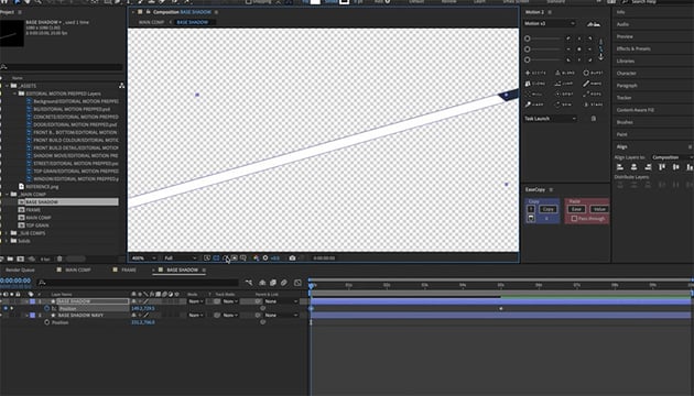
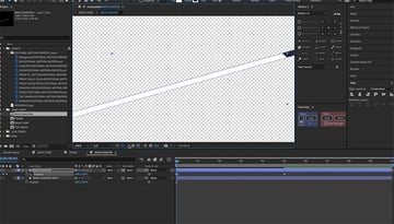
When we've done that, all we need to do is add position keyframes to make it look as if the shadow is moving across the line and ending in the same position as the original illustration. Then make the layer 3D so that it moves with the others. It'll take some time to get the lines positioned just right, but the result is worth the effort. We've created a real sense of time passing now.
Adding Creative Animation
Now what happens at 5 seconds? You get home, you turn on the light in your front hallway, and you relax from your very stressful day as a motion designer! So let's add a lighting effect now. This is where we're going to start changing what Julia's done, so remember to do it with consideration.
Creating a Lighting Animation
We'll start by grabbing the Pen Tool and drawing a simple shape to show how the light is cast from the window out into the street. Color it orange, make it 3D, move the layer down below the window layer, and give it the same Z position as the window (-200).
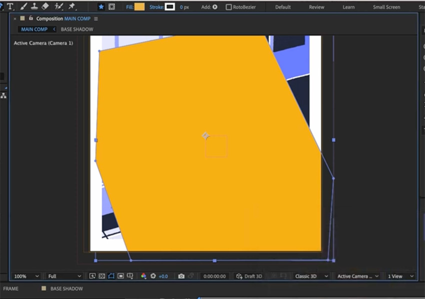

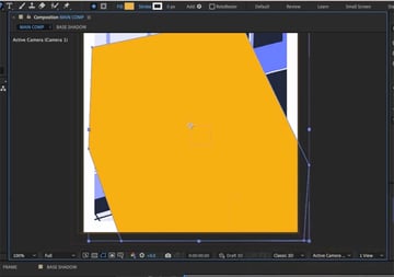
Then give it some opacity so that it's more realistic, and add a keyframe at 5 seconds to switch the light on at that point.


Next, we'll create a flickering effect as the light comes on. We can do that by adding a series of keyframes very close to each other, with the opacity going between 0 and 45. Make sure to right-click > Toggle Hold Keyframe to ensure that no animation happens between them—it's just a sharp cut from 0 to 45.
Let's also make the window turn yellow. For that, we can use the Effects & Presets panel. Choose the Fill option and make it change from the original dark blue to the new orange color as the light comes on.
Then we'll duplicate all of our lighting animations, move them to the end, and reverse them, so that the light flickers off at the end and our animation can loop again from the beginning.
Adding Texture
Finally, let's add some texture so that our lighting effect matches the nice, grainy, textured elements of Julia's illustration. We want to make this look as if she's drawn it and we haven't just added it in.
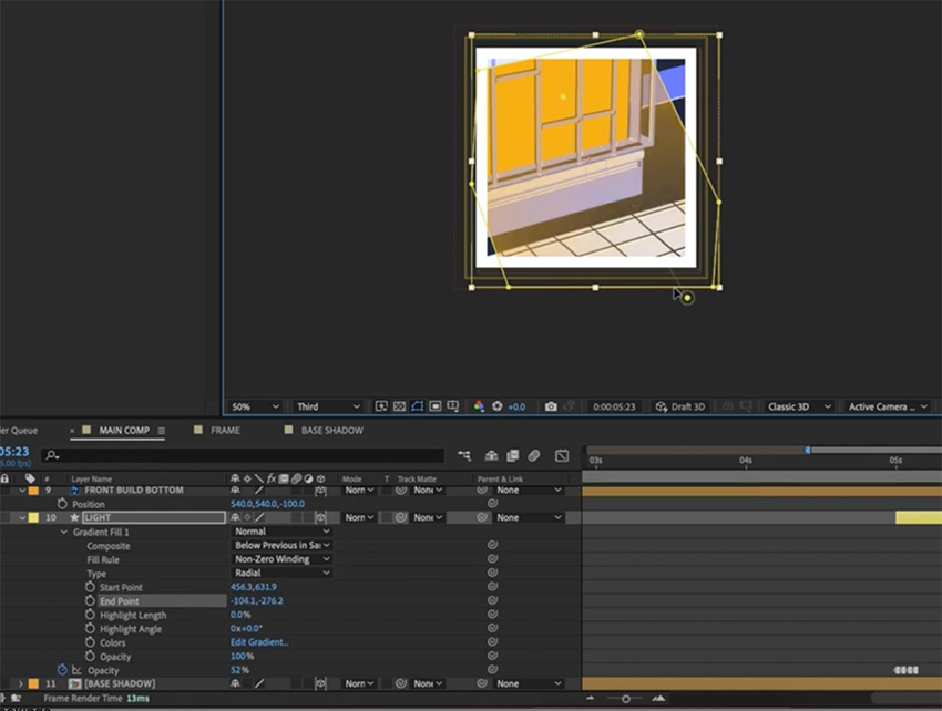
So let's add a gradient fill to the light so that we have a bit of fall-off. If you click the Fill word up in the top toolbar with your layer selected, you get all the different fill options. We want a Radial Gradient. Then if we click in the toolbar again, it'll bring up the details of this gradient, and we can change the values and even adjust the gradient using the two dots that appear.
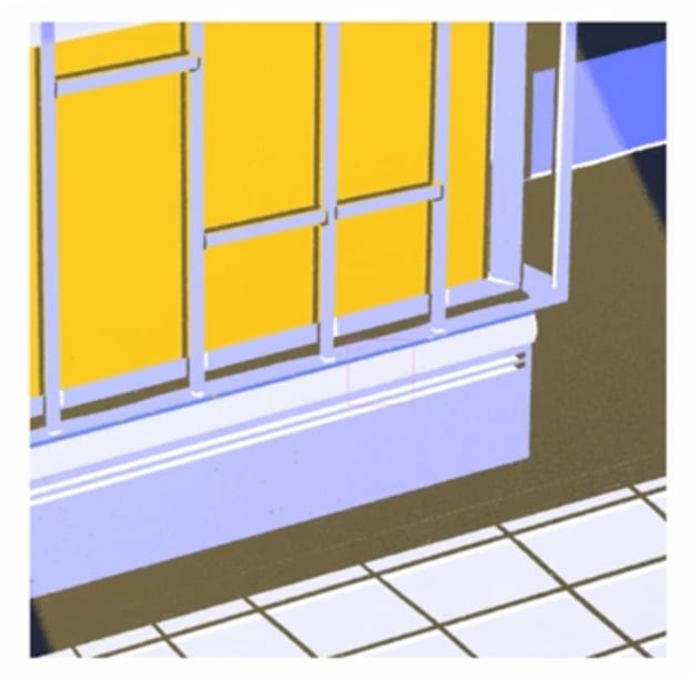
Next, let's add that grain effect by using a layer style. Layer styles are a really powerful feature of After Effects. They sit on top of all your other effects and will be applied to all of them.
When we've added a layer style, we can go in and adjust all the settings. We definitely want to pump up the Noise, which will give us a nice grain. You can also tweak some of the other settings until you're happy with the effect.


Here's what it should look like in the end.

Adding Background Grain
So we've added grain to our light, but we also want to add grain to the background to match the lovely grain pattern in Julia's illustration.
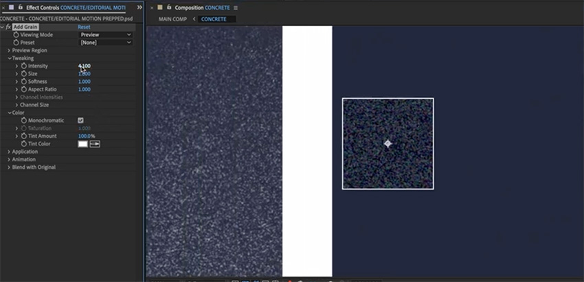
To do that, we'll go to the CONCRETE layer and right-click > Precompose. Then drag in the reference image and place it next to the one we're working on so that we can see exactly how much grain we need to add.


Now, we'll go to Effect > Noise & Grain > Add Grain. Then we can play with the settings on the left until we get a grain that's similar to Julia's. You'll see the effect being applied to a small box, so you can get it right before applying it to the whole thing.
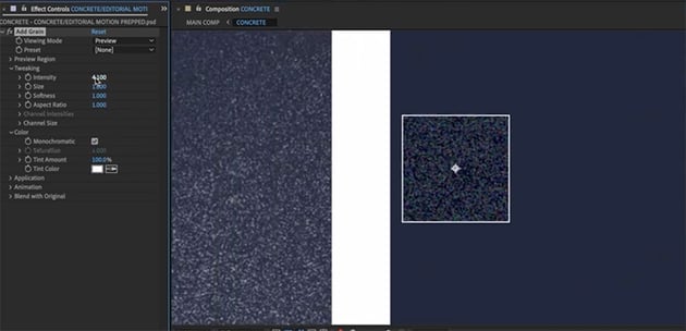
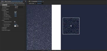
When you're happy, choose Viewing Mode > Final Output to see the grain animation applied to the whole background. You can still go back and tweak the settings or even apply other layer styles to get it just right.
Deliver Your Best Work Faster With Envato Elements
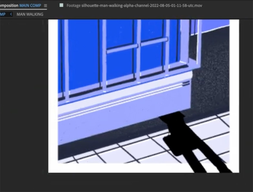
I think there's still something missing. I reckon it would be cool to add a character to this scene, but I definitely don't have time to do a walk cycle, so I jumped on Envato Elements and found this animation of a businessman walking, which I think is going to be perfect. We can make it look as if his shadow is hitting the building as he walks home.

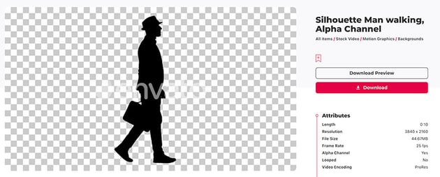

If you haven't heard of Envato Elements, one subscription gets you unlimited access to millions of creative assets that you can download and use in your projects right away—things like video templates, stock footage, music, fonts, and heaps more. If you're creating content for the internet, Elements is where you need to be.
Animating a Walking Man Shadow
Once you've downloaded the walking man, just drag him into the main comp in After Effects.
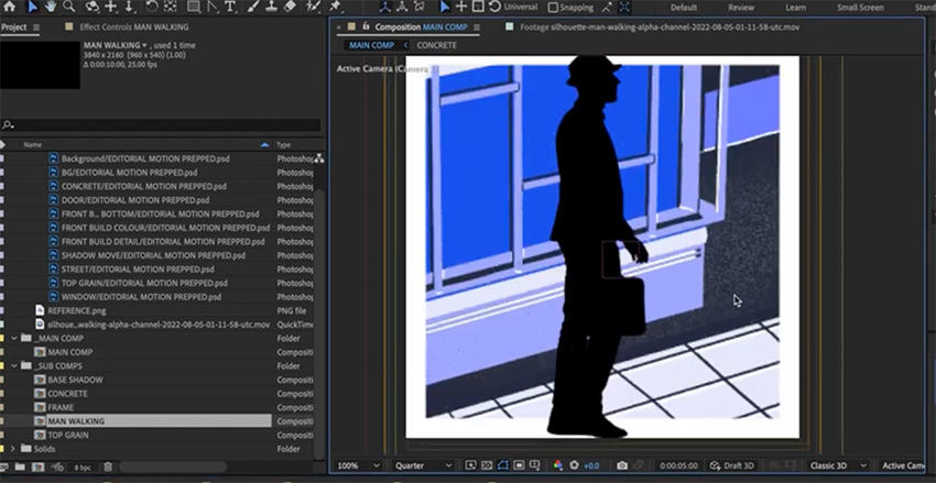


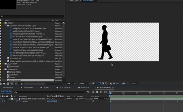
This looks pretty good, and the walking animation is set up nicely, but we do need to make a few changes.
First of all, he's walking the wrong way—I want him to go from right to left, so that it looks as if he arrives home at 5 seconds and turns on the light. So let's go into our precomp and flip him (right-click > Transform > Flip Horizontal). Then we can add keyframes so that he walks across from right to left, starting at 0 seconds and arriving at 5 seconds.

Now we're going to duplicate the walking animation four times because we're going to alpha matte it to the different parts of our building and the ground so that the shadow looks realistic. So we'll call the four copies:
- MAN WALKING GROUND
- MAN WALKING BASE
- MAN WALKING WINDOW
- MAN WALKING DETAILS
We'll make them all 3D layers so that the man is affected by the camera. We're also going to use the position and rotation to imply that he is in this scene.
Let's start with the ground—we want to bring up our rotation properties and change them so that he matches the perspective of the ground.

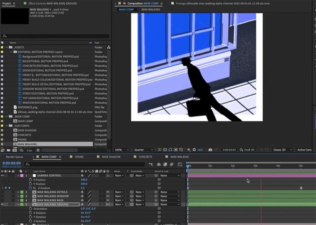

But the shadow he casts on the building is going to be different, so that's why we have the different layers—we want to change the rotation so that his shadow there matches the perspective properly. First, we need to mask off the building from the ground layer, so that the shadow doesn't fall there.


Next, we'll create a shadow in the right perspective for the building. And while we're at it, we can reduce the Opacity to 40% so that it looks more like a shadow.

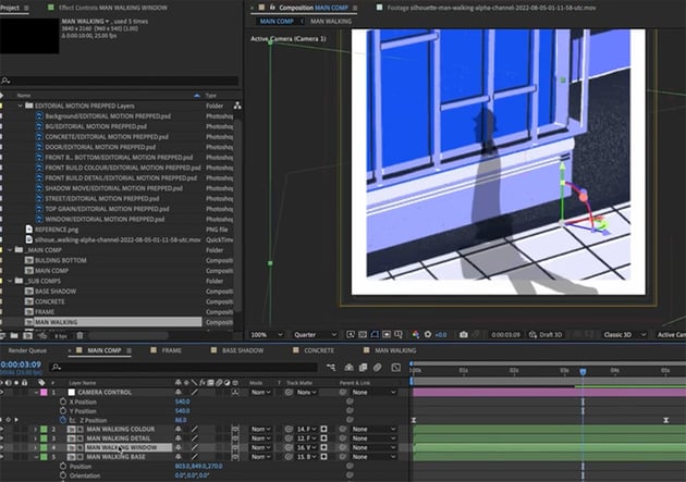

Now we're going to need to tweak it so that the shadows line up, which can be tricky. We can also make the shadows on the window and details slightly different from the rest of the building to reflect the slight change in depth. Take your time here to get everything looking realistic.
Lastly, we're going to add some grain to the man so that he matches the rest of the scene. Go to Layer Style > Outer Glow, set the Noise to 100%, and change any of the other settings you want.
Finishing Touches
Finally, just to finish this off, we're going to move the frame layer back to the top by pressing Command-Shift-). And then we just need to animate that grain that we created earlier. We're going to keep it simple—just rotate it to several different angles and then cycle between them. That will create a nice texture on top of our animation.
Then we'll add a Posterize Time adjustment layer, which will change the frame rate of this animation without changing the frame rate of our overall export. So right-click > New > Adjustment Layer and choose Posterize Time. Change it to 10 seconds.
And that's it! Our animation is ready. I'm happy with how this has turned out—we haven't gone too overboard, and we've exercised some really good restraint in making sure that this stays true to the original illustration. I hope you now understand the process of taking a static illustration and getting it moving, and you can use these techniques in your future projects.
Also check out our free After Effects tutorials to see what else you can learn. And here are some great videos to watch next.