

Introduction to color management and how to color grade in Premiere Pro
Premiere Pro 25 makes color grading ridiculously easy thanks to Adobe's killer new feature: color management.
Whether you're a total newbie, just finding your groove with Lumetri Color, or a seasoned LUT wizard craving even more control, the path to a pro-level color grade is always the same. And guess what? We’ve got your back with a step-by-step guide to mastering color correction and grading—all within Premiere.
But before we dive in, here's the deal: to truly unlock Premiere Pro’s color grading superpowers, you need to nail the two key stages:
- Color Correction
- Color Grading
Color correction in Premiere Pro


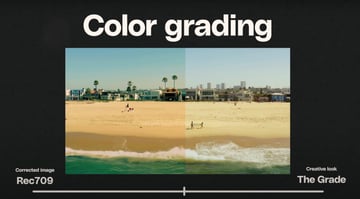
It's like swapping your cash at the airport before landing in a new country. You need the right currency to actually buy stuff and function. Same deal here: your washed-out log footage isn’t ready for primetime until it’s converted to Rec 709.
By telling Premiere where you’re headed (like Rec 709), it handles the heavy lifting in the background, breathing life into your footage with rich colors and balanced contrast.
Color grading in Premiere Pro
Once your footage is corrected and looking solid, it’s time for the fun stuff—grading. This is where you unleash your creativity, dialing in the perfect vibe, mood, and cinematic flair that makes your project unforgettable.


Now that we've cleared that up, let's jump into Premiere Pro and see how to make your footage look next-level.
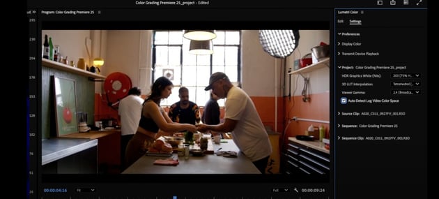
Diving into Premiere Pro: Setting up your workspace


Footage correction
Footage correction is basically fixing any problems with your video – like if it's too dark, too bright, or has weird colors. It's about getting your footage to a good starting point before you start getting creative with color grading.
Suddenly, that dull, gray footage isn’t so boring anymore. Premiere works its magic, converting it from flat log to vibrant Rec 709 with proper color and contrast.
Understanding scopes
When it comes to color grading, scopes are your ride-or-die.
This is an example of what the Lumetri Scopes in Waveform (RGB) look like:


There are a few of visualization options (Vectorscope YUV, Histogram, Waveform RGB, and Parade RGB), and each of them is used for different purposes. For example, Waveform RGB is more commonly used checking footage on set, when you're shooting.
In this case, let’s switch to the Parade scope—it maps out luminance and breaks down the red, green, and blue channels for you.
Why Parade over Waveform? Simple: it gives a way cleaner, clearer picture when you’re dialing in those colors like a pro.
Color balance
Color balance is concerned with getting the colors in your image to look natural and harmonious. It's about making sure no one color is overpowering, so you might need to add a little warmth or coolness to even things out and get a pleasing, balanced look.
Making it happen in Premiere Pro is no sweat:

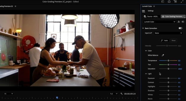

1. Start in the Basic Correction Tab. Even if your footage is already corrected to Rec. 709, it’s a good idea to check for improvements. Not every image is perfectly exposed or balanced, so knowing how to make adjustments is key.
2. Fixing Exposure & Luminance Levels. To start, look at your image's luminance and contrast. You’ll often find areas that can be fine-tuned even if the exposure looks decent at first glance.
- Highlight Correction: If your highlights are blown out, like hotspots in windows, reduce them using the Highlight Slider. This pulls back clipped data from the top of the graph, giving you more control.
-
Shadow & Black Adjustments:
- Use the Black Slider to manage the darkest parts of your image.
- The Shadows Slider can lift dark areas without making them look washed out.
3. Understanding the Sliders
- The Blacks and Whites Sliders refer to the absolute darkest and brightest parts of your image—the far edges of the luminance range.
- Bringing shadows up while managing highlights creates a balanced, well-exposed look.
Basic correction workflow
Time to fix that footage and get it perfect.
First, let’s get exposure under control in that same Basic Corrections tab. For reference, shadows and highlights adjust the mid parts of your image.
- Pull down the Highlights slider to tame those hotspots.
- Nudge up Shadows and Blacks just a bit to lift the darker areas.
Isn't it cool that you can watch how the scopes react in real time as you move the sliders?!


Now that you’ve cleared some space, it’s contrast time. Use the Contrast slider to stretch out the light and dark sections for more punch.
Creative tab
Let's carry on and get creative, shall we?
The Creative tab in Premiere Pro is where you can apply creative LUTs to stylize your footage.


- LUTs in this tab are designed to give your video a specific look or mood, often inspired by cinematic styles.
- They’re perfect for quickly elevating your corrected footage with just a click.
If you're looking for additional creative tools, check out platforms like Envato. Find a basically-unlimited library of premium downloadable LUTs, stock footage, video templates for Premiere Pro and After Effects, and even high-quality music for your videos. All that and more for a low monthly fee!
Balancing and saturation (curves)
So, in this case we're not playing too much with the Creative tab, so let's get to good part. Let's mess around with grading, balancing and saturation.
Time to bust out the Curves tool. Curves in Premiere Pro lets you easily tweak your image's brightness and color. Think of it like a seesaw: drag the line up to brighten, down to darken. You can adjust highlights, shadows, and even individual colors. It gives you complete and precise control, making a powerful tool that's easy to use.
In this example:
- First, ensure the white dot is selected—this controls luminance values.
- If shadows look a bit "milky," it's often because they’ve been lifted too high from the black point.
- To fix this:
- Create a point in the middle of the graph (the tonal midpoint).
- Pull the bottom of the graph slightly below the line to darken shadows while leaving mids and highlights untouched.


Next up, let's dig into shifting mood and tone with color channels:
- Select the Red Channel to subtly reduce red and enhance blue/green tones.
- In this example, removing a bit of red makes the green wall in the footage stand out more.


Want to make certain colors pop? Hit up the Hue vs. Saturation curve and fine-tune those hues to perfection.
- Drop a midpoint on the curve to anchor it.
- Drag the bottom point below the line to darken shadows and boost contrast without messing with your mids and highlights.
- To boost the saturation of a specific color, create points around it on the graph and drag the midpoint upward.


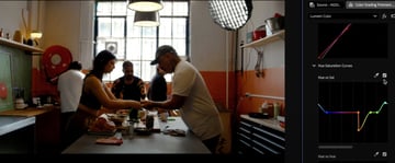
After all that, all that's left is toggling the curve adjustments on and off to see the difference. Subtle corrections can significantly improve the balance and aesthetic of your footage.
Ready to move on?
Color wheels
Okay, let's talk about the Color Wheels and Match tab. This is where you can really start playing with the look of your footage. You'll see sliders for:
- Shadows (the dark parts)
- Midtones (the middle tones)
- Highlights (the bright parts)
These options let you tweak the brightness levels in those areas.
For this project, let's try one cool trick:
- Add just a hint of blue to the shadows
- Try nudging the midtones and highlights a little towards orange.


It's a classic cinematic look, kind of that teal-and-orange thing you see in movies. Give it a try and see what you think!
Vignette Tabs
So, you want to add a vignette (also known as "darkened edges")? Premiere Pro's got you covered! There are several ways to achieve just that:


- Use the Vignette section in the Lumetri Color panel – super simple.
- Get creative with the Circle effect (just remember to set the blending mode to Darken and invert it).
- If you're feeling fancy, try using masks and effects like Brightness & Contrast for more control.
In this case, just add a hint of darkening around the edges to help draw your eye to the center of the frame. It adds a bit of polish and gives the whole image a nice sense of depth.
You're done learning how to color grade in Adobe Premiere Pro!
So there you have it! A complete rundown of how to use Premiere Pro for color grading and color correction. Whether you're just starting out or you're a seasoned pro, these tips should help you get some gorgeous, cinematic results.
Don't forget to check out Envato. You'll get tons of great creative assets and every premium digital item you could ever need to help take your projects to the next level!
Happy grading, and have fun!


