

Welcome to the second installment of this two-parter on shooting with green screen for compositing. We're going to use the lessons from the first article to light, shoot and process a complete composite image. I've learned (the hard way) that the key to successful compositing is not to over-think it. Keep it simple and you should be fine.
I'm assuming in this article that you know much of the basics of the Photoshop workflow and have a reasonable understanding of lighting, so I'm not going to explain every single button, or things like the Layer Palette tools. You should probably be fairly proficient with this kind of stuff before you attempt more intermediate to advanced digital techniques like this.
The Shot
I'd already taken the background image for the composite I'm going to work through, so it was a case of matching that with my lighting. This is the order in which it's probably best to work, given that you can't really control the natural light too much, but you can match it in the studio quite easily, given enough lights. After several tests with different lighting arrangements, the one I settled on was this:
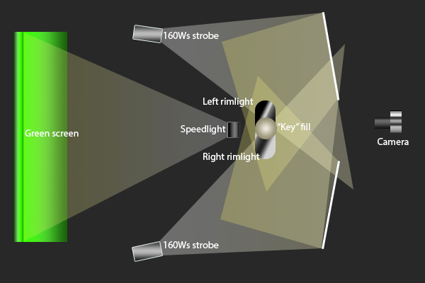
That diagram is reasonably to scale. Note the large gap between me and the screen. I was having trouble with green spill at four feet, so I increased it to six and diffused the screen light more, and it became much less of an issue. The actual set up looked like this:

By the way, I don't recommend having yellow walls in such a small space! We just haven't had time to re-paint yet. The lighting diagram explains why the backlights aren't really pointing at me so much as forward, in order to get sufficient bounce from the reflectors without massively overheating the rim lighting.
I used a speedlight for the screen because the zoom function creates better light spread from a smaller footprint on the studio floor, allowing it to be set at the right height but stay hidden from the camera behind me.
This particular setup is ideal for the nighttime background I'm using. You'll almost certainly need to adjust the ratios for daytime composite images, and likely have softer edge lighting, since it would appear to be coming from the sky rather than "point-source" streetlights.
So, that was the final setup, and the image from that sequence that I settled on was this one:

I'm all in view in front of the screen, everything's correctly lit, the pose (or lack thereof) is acceptable, and the remote is hidden. Since each new lighting arrangement was a spur-of-the-moment idea, there wasn't really time to bring in a model. So once again, I'm the guinea pig!
You may be wondering why I'm relatively dark compared to the rim light. Basically, this was done to match the lighting of the background image as you'll see shortly. The brighter images didn't look natural to me.
Keying
Optimisation with ACR
Now that we have the front plate image, we need to create the mask that will allow us to composite it over the background. Fortunately, Photoshop has a very handy tool for this called Select > Color Range. First though, we need to use Camera Raw to optimise the image for masking.

The above settings allowed me to push and pull the tonality of the image into a range I felt suited it, and popped me off the green background enough for the keyer to work its magic. I didn't stop there, though. Next I worked the HSL sliders to make that background as neutrally green as possible. This was relatively easy, since ACR has a little box by the histogram where it gives the RGB values of the pixel you're hovering over.
The aim is to maximise the green value and get the red and blue values as close to each other as possible, by adjusting the hue sliders for green and cyan. By making the green more or less yellow, you're controlling the amount of red in it (green + red = yellow in additive colour theory), and by making the cyan more or less green, you're adjusting the amount of blue the green area contains.
For example, if I moved the cursor around the green screen and the box said, say, there was consistently around 20 points more blue than red, like (65, 127, 84), then I would move the cyan hue slider more towards the green.
This is why it's important not to have greenish-yellow or greenish-blue objects in your images, if you can help it. With stills, it's easy to un-mask them, but with video would likely require a lot of tedious keyframing.

After that, I just did an auto lens distortion correction, and hit Open.
The Key
Once in Photoshop, the first thing to do is to delete all the extraneous parts of the image to reduce the amount of processing Photoshop is required to do.
Duplicate your background. This is almost always my first step so I always have a quick fall-back in case of disaster. Turn off the original background layer, because we don't need to see it. On the duplicate layer, a simple zero-feathering lasso around the outline of your subject, hit Ctrl+Alt+I to invert the selection, and hit Delete.

Next is the keying! Go to >Select > Color Range, and click on the green area in either your image or the little preview window. If your lighting isn't perfectly even across your screen, it should fade out the mask in the preview. Ctrl+Alt+Click on any areas of green that haven't already been picked up.

Once you're done, it should look somewhat like this. You may want to play with the Fuzziness Slider until the hair outline looks about right. I ended up somewhere in the middle. I only had to click twice for this mask; once at the top for the even-lighting-behind-the-hair, and once for the bottom where the speedlight fell off a bit. If it's significantly more complex than this, your lighting probably needs tweaking.
Once you're happy with how it looks, hit OK, and it will produce some marching ants around your green area. Since we actually need the rest of it to show, not the screen, we hit Ctrl+Alt+I again to invert the selection. I duplicate my layer again at this point, although there's not strictly a need, and then hit the Layer Mask Icon in the Layers Palette.

This produces a mask exactly where our selection was, and at this point keying should be complete. Once I nailed the lighting (which didn't need to be magenta, just well-backlit), I had no keying troubles whatsoever. Resist the temptation to hit Refine Edge before you create the mask, too. I did this a few times, assuming that because it's a superpower in other situations, it would improve my key here, but it actually ruined the results and created a nightmare green halo around the hair. You have been warned!
We're actually now done with the foreground plate, it's ready to composite. I know! It's almost too easy. This is why I said in the first article that a green screen is better than a white seamless, which requires a fair amount of manual masking.
Any sharpening, colour correction, or other moves on the foreground must be sympathetic to the background plate, so we can't do anything along those lines until we're compositing.
The Composite
Now let's open our background image, then copy and paste the foreground plate on top of it. It will probably look a bit ridiculous, but that's ok for the time being. Now would also be a good time to make your front plate a Smart Object. Right click on its layer the click Convert To Smart Object if you're not entirely sure how you're going to size and compose it.

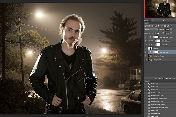
The next thing I did here was to take advantage of the mist in the background, and adapt the light sources to my subject. I duplicated the background layer, and then dodged all around the lights, following the beam lines, adding in bits of lighting here and there, and generally trying to reduce the contrast immediately around the subject. This improves the readability of the subject, just like when lighting in a non-composite setting. This may be a stylistic choice, but I'd recommend you attempt to do something similar for your background as far as it allows.

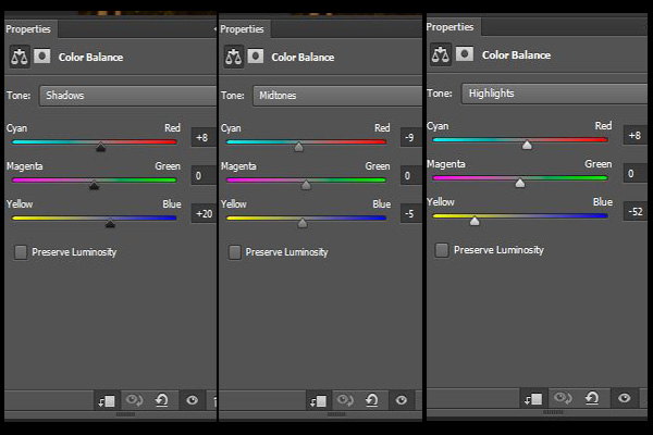
Once that's adjusted to your liking, the next step is to use a Color Balance Adjustment Layer to balance the weird colour differences. I liked the sodium-vapour look of the night-lit background, so instead of white balancing that, I un-balanced my foreground.

I cooled down the shadows while adding red into them. The grey of the sky contains a surprising amount of red. I find it a good idea to leave the Info Palette open at all times to find out things like this. I put a little sodium-yellow into the midtones while keeping them cool with some extra cyan, then blasted the highlights with yellow and added a touch more of that strange red. This layer was applied only to the subject by Alt+Clicking the line between the two layers in the layer palette.
After figuring out the colour balance of your various tonal ranges, it is a good time to make sure the tonality of your front plate is closer to that of your back plate. This will improve the realism. I added a Curves Adjustment Layer to crush the blacks very slightly because the amount of light on the jacket looked strange, and pulled down the highlights such that the street lights appeared as more natural lighting sources for the degree of edge lighting.
Because I added this adjustment layer while on the subject layer rather than the colour balance layer, Photoshop automatically created it as a second "mask" layer applied only to the subject layer.

Once everything was balanced, I decided I didn't like the oversaturated yellow leaves by the street lights, so I added a Hue/Saturation Adjustment Layer to the entire image, and brought the saturation levels of everything way down to -32 on the master channel.
I actually liked the look of this, it added a little more "grit" and cinematic-ness to this night shot without doing that ugly crunchy-sharpening thing, so I didn't bother masking it over just the leaves.
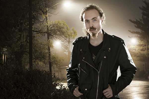
At this point I was effectively done with the "natural composite" aspect, but I wanted to make it look more polished. First, I observed that the rim lighting would appear more natural if I was the other way around, so I flipped the subject layer horizontally and adjusted it back into place.
This allowed the car headlights in the background to peek through and appear to light the inside of the arm, as well as putting the street lights in more physically correct places for the amount, placement and angle of lighting on the subject.

This is observational, and each image will be different. Once you're done with the basics outlined above, it's a good idea to look closely at your "final" image and ensure that it makes as much sense as it can, or if the composition could be tweaked to improve its naturalism. Our eyes are very sensitive to oddities in lighting.
Finishing Touches
Now that the final colour and tonal adjustments have been made, it's time to put the finishing touches on the image. First is creating the final crop. After flipping the subject plate, I removed that distracting car and house from the right hand side, while retaining my fingers and the nearest street light.
Of course I needed to remove that ugly cable running through my head (which has probably been distracting you for this whole article), which I mostly did with the spot heal brush, but had to use clone stamping around my head and in the tree branches.
Any distractions you have, such as poles, wires, aerials, trees, whatever, should be ruthlessly removed wherever possible. We're as far removed from photojournalism with this technique as it's possible to be, so don't worry about manipulating the environment in any way.

I also added just a little more dodging and burning, boosting the contrast of the road a little and adding some light onto the road sign. The image somehow appeared almost editorial-commercial to me at this point, sort of like environmental portraiture, and the sign felt like editorial information. While realistically meaningless, aesthetically it adds some interest without overwhelming the main subject area. I brightened up my face too, so it didn't get lost in the flare of the lights, which I also boosted for aesthetics.
Finishing Up.
To wrap up here, let's recap what I've covered today. First, I explained my lighting setup in terms of the previous article, and it made more sense as soon as you saw the background it was getting dropped into. Then we saw how quick and easy keying is in Photoshop when the lighting is solid and follows the rules.
I then went step-by-step through the compositing, noting where you may diverge from my particular workflow in this instance. From the first paste, through adjusting lighting, balancing colour and tone, recomposing when necessary, to final touch-ups that you should be familiar with from regular work.
As you can see, composite shooting isn't actually all that difficult as long as you have a good eye for detail and know how to light, which should both come fairly easily to most photographers.
I hope this helped clear up any misgivings or confusion about compositing, and encourage you to all go out and give it a try. As always, questions? Comments? Hit up the comments below!
 By
By


