
 Lessons: 14Length: 1.3 hours
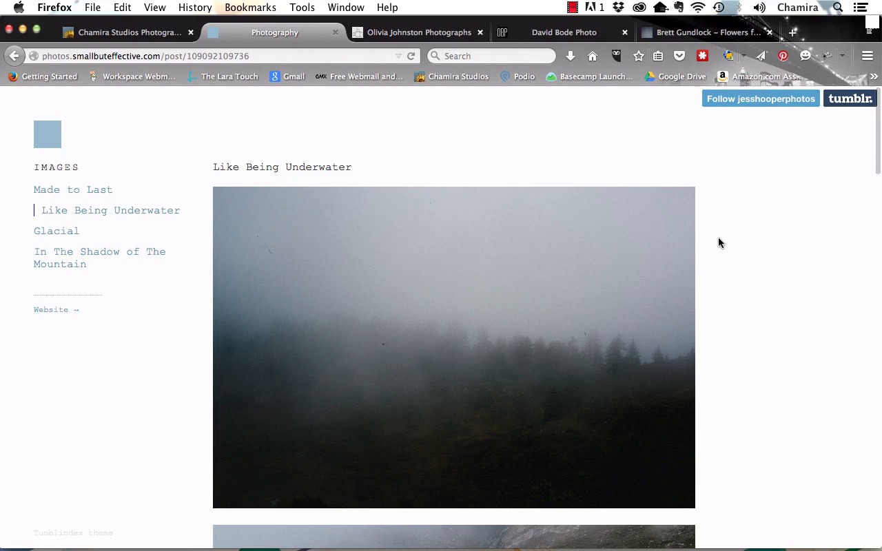
- Overview
- Transcript
3.2 The Web Portfolio
In this lesson we take a look at a handful of web photography portfolios, and discuss the effective elements and strategy behind their assembly.
1.Introduction
1.1Introduction04:26
1.2What Is a Portfolio?03:37
1.3Singles vs. Stories04:06
1.4Crafting a Vision For Your Portfolio and Setting Goals05:14
2.I Have Photographs. Now What?
2.1Deciding What Kind of Portfolio to Make, and the Process of Creation05:57
2.2Portfolio Editing: Assemble Your Images05:16
2.3Portfolio Editing: The Rough Cut04:53
2.4Portfolio Editing: The Final Edit06:07
3.Assemble the Portfolio
3.1Get Ready to Assemble06:51
3.2The Web Portfolio06:42
3.3The Tablet Portfolio06:12
3.4The PDF Portfolio04:50
3.5Print Portfolios04:44
4.Conclusion
4.1Presenting Your Portfolio11:32
3.2 The Web Portfolio
In this lesson we'll take a look at a handful of web photography portfolios. And while we're doing it we'll discuss the effective elements and strategy behind each one. So, first we'll start off with my portfolio. And this is the Homepage, and as you'll see it's a nice clean design. You'll recognize these images as the ones that I was editing down earlier in the course. I have a simple menu on the left hand side of the home page. And if you go all the way down to the bottom, you'll see that I also have a way for people to contact me. If they click on send a message, it'll actually show them my email address. I also have a link for Facebook, and I have the basic menu down here as well. And so this bottom footer is gonna stay with me no matter what page I'm on, on this website. And we'll head to the Travel + Nature gallery. And you'll see that I have my simple menu up here at the top. And you want to keep your menu simple so that people can easily find their way around your site. If they're not able to figure out the navigation, chances are they're gonna leave. And here on the upper left hand corner, I have basic navigation information so that people know exactly where they are within my site. These are also known as bread crumbs and they keep people from feeling disoriented. And so here we have the photos in the gallery. And for my site, I'm actually using Zenfolio, which allows me to control the layout and size of my images, although other services will do that as well. The number of images that you have in your gallery can really depend on the subject matter and also your experience. For this course, I kept it to a smaller number of images. And if you click on each image, you're able to view it. And down below, I have simple navigation, so that they can actually click through each image or use their arrow keys. And, if I wanna see a larger view of each image, all I have to do is select it and it gives me a view of the image that takes up most of the screen. Then I have additional simple navigation here on the right, and also on the left. And I have a pop-up that tells them they can still use their arrows if they want. And when they're done with the larger view, they can simply select this x and it takes them back to the smaller view. And if they want to go back to that particular gallery, they can simply select Nature + Travel Photos and now they're back here. And you'll see my footer information is still here on this page. If they wanna see these images as a slideshow, they can select this button on the right hand side. And it takes them to a completely full screen mode, where they can cycle through the images. And when they're done with that, they can select x up in the corner, and they're back in the gallery. And so really, the point is to make this as simple as possible, where they can view the images clearly and judge my work. You don't want them to be distracted by the design of your site. I also have a simple contact page, where they can send me an email message. They can visit my website. They can like me on Facebook, or they can fill out a contact form. And now let's take a look at a handful of other web portfolios. I'm gonna head over to Jess Hooper's website, another photographer, and you'll see that the home page is very simple. And right away you're able to focus on the images. There's basic navigation here on the left hand side as well. And if we go to one of the galleries, you'll see that it still keeps that simple theme going, where right away your eye is drawn to the images. And on this site you simply have to scroll down and look through the series of images which you can also see are related to each other. And there's a story, there's a narrative behind each one. And so you can see it's a very nice, clean design. Next, let's head over to Olivia Johnston, another photographer. And, once again, you get that nice clean design on the home page, and she has a very large image right away. And, also, her website is responsive as well, and so you see that the image actually resizes with the browser window. Again, this is important because most likely people will view your work on several different devices. Not just a laptop, but probably a tablet and maybe even their phones. And let's head over to Commissions and Collaborations. And we'll take a look at the Art and Science Journal: Portraits. And so here, we have the images nice and large. And there are simple navigation arrows so that you can cycle through each one, or you also have a menu on the bottom. She also has a very short description underneath the photo, so that you have a little bit of background on the portraits. And now let's check out David Bode's work. His website immediately has the images as large as possible. And also cycling through so that you can look at each image one by one. He has a simple menu here at the top and if you scroll down the menu will stay with you. Down at the bottom you can head over to the portrait gallery, the commercial gallery, or the product gallery. And he has social share buttons in his footer as well. You can also reach his other galleries under the Portfolio link. And so if we head over to portraits, you'll be taken to the images in that gallery. But first, he does have a brief description of his service. And it really adds a personal touch that allows the viewer to get to know him better. And if you scroll down, you're taken to the images in his gallery. And if you select one, it isolates the image by darkening the details behind it and you can cycle through using simple navigation. And here you'll see in his gallery, that he actually has photos from different shoots. And it really allows you to get familiar with his style. And finally, let's head over to Brett Gundlock, and check out his work. And, once again, the style is clean and professional. He has social navigation here, at the bottom of this menu. You can scroll through the images and look at each one, in detail. And, if we head over to a specific gallery in his web site, we're taken to those images, with the menu staying in place, and so you're able to cycle through. And he also incorporated text, giving you a background of the images. Which is important, in this case, because these are a group of related images from a single event and there's a story behind them. And then, on your own time, you can cycle through the images. So as you can see, the design of your web portfolio entirely depends on you and your personal branding. That brings us to the end of this lesson. In this lesson, we took a look at a handful of website portfolios just so that you can see what's possible. A unifying theme among all of the portfolios was a simple, clean design and easy navigation, with the primary focus being on the photos themselves. In our next lesson, we'll take a look at the tablet portfolio.


