
 Lessons: 15Length: 1.4 hours
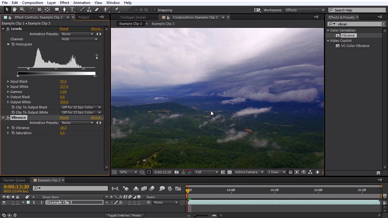
- Overview
- Transcript
4.1 Basic Color Correction
You will learn some basic color correction techniques for aerial footage that was filmed in a Flat picture profile.
1.Introduction
1.1Introduction01:28
2.Preparation
2.1Camera Settings05:49
2.2UAV Preparations04:24
3.Optical Fixes
3.1Reducing 'Jello' Effects in Post08:28
3.2Lens Distortion Removal05:17
4.Color Correcting Aerial Footage
4.1Basic Color Correction07:04
5.Footage Speed
5.1Slow Motion02:23
5.2Speed Ramping08:32
5.3Faux Slow Motion03:48
5.4Adding Motion Blur03:36
6.Stabilization
6.1Stabilizing a Shot10:41
7.Zooming in Post
7.1How to add a Faux Zoom to a Shot04:45
8.Color Grading Aerial Footage
8.1Color Grading11:26
9.3D Camera Tracking Aerial Footage
9.13D Camera Tracking07:43
10.Conclusion
10.1Conclusion00:59
4.1 Basic Color Correction
In this lesson, we're gonna learn how to do some basic color correction on our aerial footage that's been filmed in a flat picture profile. I'm gonna be working with Example Clip 3 from the project files. We can see we've got a cool landscape shot here that was filmed on an overcast day with a storm coming up. You can see it's very low contrast, we have a lot of dynamic range here, but there's just not a lot of contrast and there's not a lot of saturation in the image. So what I want to do is basically color correct this back to the way it looked when it was shot. So the first thing I want to do it is add a levels effect to this footage, so I'm going to go up to the window. Select the Effects and Presets panel here, I'm gonna type in levels. It's under the Color Correction effects. I'm just gonna drag this over to my clip. Move this over so we can see everything here. Now sometimes when you plot the levels of effect you won't see any histogram information right here. What you can do is just grab this end arrow. Move it over a little bit and your histogram should show up. So I'm going to pull that back over. All right, what we can see on our histogram here is we have a lot of information right here in the middle but we don't really have any information in the dark black area or the bright white area here. So what we need to do is tell the levels effect where our blacks and our whites are. Basically where the brightest white is and where the darkest blacks are. So we can do this by pulling out the input black tab here on the end, I'm just gonna pull this up. Right around the fall off area on the back end of the histogram. Now what you don't wanna do is actually clip the blacks and bring the black tab up too far here. So when I do this, you can see the image gets very crushed. And the blacks just get completely dark, we're losing a lot of detail information here, and the colors just don't look very good. So what I like to do is actually move the input black a little bit after the falloff of the blacks here on the end of the histogram. That way it doesn't crush any of the color information there. I can look here and see where the darks are. We're getting a little bit of a dark spot here, so let me pull this back just a little bit further. Now we can do the same thing with input white here, I'm going to pull this down right about there. And now we can already see we already have a lot more contrast in our image. This image looks a lot brighter. We have some good vibrant colors going on and we can see actually details that we couldn't see before up here in the clouds. We can see a lot of contrast detail right here in the center of the storm. It's looking very good. We need some good greens and blues here. Now if you wanted to you could almost stop your basic color correction right here because we have contrast, we have saturation. The shot looks a lot better. And we're getting that dynamic range because we filmed the flat picture profile. However, we're gonna take this a little bit further. And the next step I like to do to my footage is that of a vibrance effect. So I'm gonna go up to Effects and Presets here. I'm gonna type in vibrance. I'm gonna pull this effect over and put it to my clip. Now I like using the vibrance effect a lot more than the saturation effect because the saturation tends to bring up all the colors at once. And I'll show you an example of this cuz with the vibrance effect you actually have access to vibrance and saturation. So I'm just gonna pull the saturation up to about 40. And you can see, we get this very hyper real look, where all the colors get brought up in equal percentage. And it just doesn't look very appealing here because we have this red spot that's blown out of the blues, just very unnatural and you get this, what I like to call, the nuclear grain here on the greens and it just is not a very natural look. Looks very synthetic, so I'm going to take the saturation back down to 0. Vibrance is a much smarter effect, it kind of adds saturation in a much subtle way, and adds it more to the greens and blues over other colors. So I'm gonna bring this up to 40 again so you can see this. Now we can see this, this gives it much more richer tone to our image. Looks a lot better especially for nature aerial shots. Now this is a little bit more of an extreme example, so I'm gonna dial this back again to about 18 or so, just to add a little bit of punch to that image. So this is looking really good, and let's say we notice this really cool looking blue tone here we're getting. But let's say this actually is not the right color blue when we shot this. Let's say it was a little bit more closer to cyan. And let's say these trees are a little bit darker. So we can do a little bit more color matching here. I'm gonna add the hue and saturation effect. It's also under the Color Correction effects, I'm gonna drag this to my clip. And what you can do on Hue and Saturation is you can actually adjust the color tone to a specific color channels. So under Channel Control here, I'm gonna dial down to the blues. And you can actually adjust the hue of the blues to make it a little more cyan so I'm gonna just move this back a little bit. Now you can see how that changed and shifted to cyan colors. And you can move this as far as you want to different color tones. You'll have to be careful how far you push it though, cuz you'll start to get a lot of artifact in here. Let's see, when I move this to the reds, we're seeing a lot of artifacts, does not look very good at all. So I'm gonna set this on about -10 or so. And that'll change it to a nice cyan color blue. Now if I zoom in here real close, and this might be very difficult to see in this lesson, on the tutorial. But I'm getting a little bit of artifacting in here because of this blue tone, so what I can do is I'm also gonna go to the cyan channel and I'm gonna move that back to about -10 just to help these colors blend a little bit. It helps when you shift colors that are kinda near the same spectrum together, that way you get less artifacting going on. Now for our trees, one thing to know especially when you film on a sunny day, the greens are typically gonna fall more on the yellow channel than the green channel. In this case, since we filmed on an overcast day, it's gonna fall kind of 50/50. But just keep that in mind when you're gonna adjust the green. So I'm gonna click on the yellow channel first. And I'm gonna move the hue of the yellows over about 10 degrees or so, so it's giving that a little bit more of a greener vibrance here. You don't want to move this too far, and we can see another problem happening here. I turn this on and off. We can see that this grass here, which is kind of a lighter color than these trees, it's kind of shifted to a darker green, looks a little bit unnatural. So I'll check this on an off. You can see before and after. So you want to use very sparingly. I'm gonna set this back to about 10 and to help explain a little bit more, I'm also gonna shift the greens over about 10 degrees. And now I think our greens are the right color. But I think they're a little to bright. So I'm actually gonna pull back the lightness of the greens. So you're probably doing about -30. I'll also do that for the yellows as well, just to help that blend a little better. And there we go, now we're getting a darker, much more nature looking green. We've got our nice blue cyan going on there. So now our color correction is pretty much done. If you want to add a little more of a sharpness bite to your footage, if it was filmed in kind of a softer profile, you can add the effect Unsharp Mask. It's under the Blur and Sharpen effects. I'm just gonna put this on my footage. And you're gonna wanna be careful when you use this effect, cuz it can magnify your artifacts here with the sharpening. I'm just gonna check this on and off so you can kinda see what's going on here. It can just help to add a little bit more bite to your image. I like to set the amount on mine to about 20. And there we go. I think we've done a very nice color correction on this shot. I'm gonna go ahead and check the effects on and off so we can see a before here. Very low contrast, very unsaturated, and we have a lot of dynamic range. Now we can see it with the effects on. Looks a lot more like it did when we actually shot the shot. One more thing to note here, I've got this little area of clay. This is where there's been some landscaping work done and there's no trees, and that red's kinda standing out like a sore thumb, so I can go back up here to my Hue and Saturation, I'm going to go the red channel. I'm just going to dial back the red saturation until that kind of goes away. There we go. It looks a lot more natural. All right, that's how you do basic color correction on your aerial footage. In the next lesson, we're going to learn about slow motion and we're going to learn how to properly interpret footage shot at a higher frame rate in order to gain a true slow motion look.


