
 Lessons: 18Length: 1.3 hours
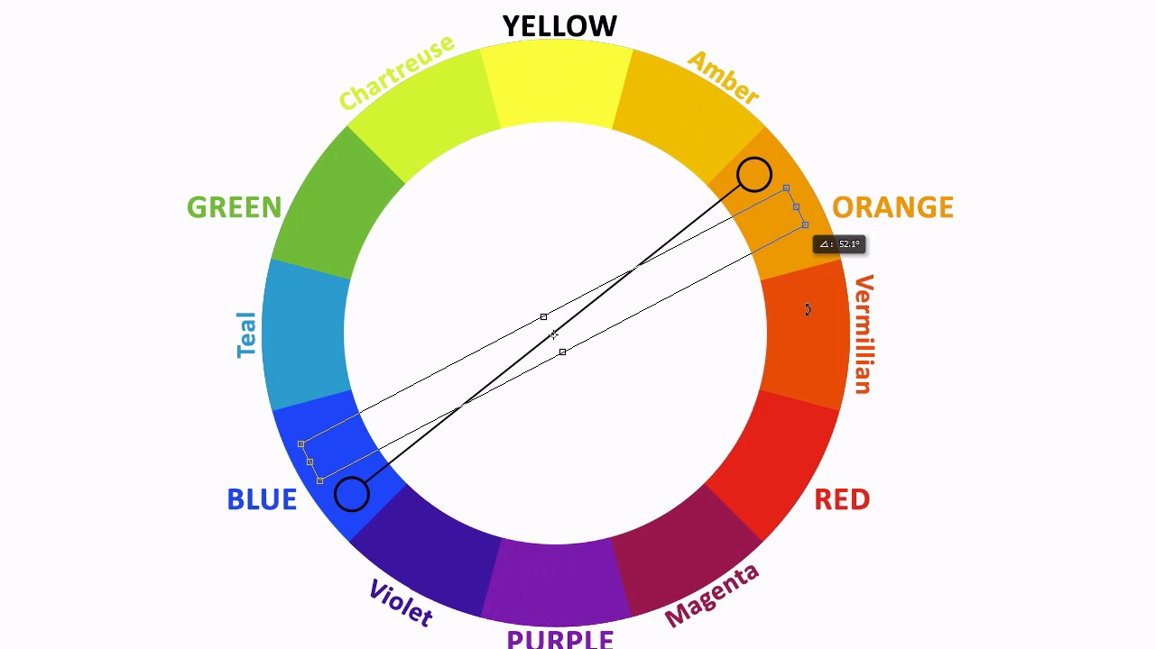
- Overview
- Transcript
4.1 Color Theory in Design
Color is a huge component of how designers approach a design. If you’ve never thought much about color, how it works, and how to make it work for you, then you are in for a treat as we dig into the basics of color theory!
1.Introduction
1.1Introduction02:46
2.Lines
2.1Lines in Design03:07
2.2Lines in Photography05:00
2.3Photo Assignment for Line02:45
2.4Lines Photo Evaluation09:20
3.Shape
3.1Shape in Design03:02
3.2Shape in Photography04:15
3.3Photo Assignment for Shape01:37
3.4Shape Photo Evaluation07:48
4.Color Theory
4.1Color Theory in Design03:37
4.2Color Theory in Photography04:27
4.3Photo Assignment for Color01:52
4.4Color Photo Evaluation06:53
5.Visual Weight
5.1Visual Weight in Design05:05
5.2Visual Weight in Photography04:30
5.3Photo Assignment for Visual Weight01:40
5.4Visual Weight Photo Evaluation07:23
6.Conclusion
6.1Conclusion01:17
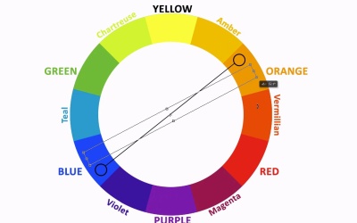
4.1 Color Theory in Design
Hello, everybody. Welcome back to basic design concepts for photographers. We're starting out on the fourth chapter which is color and contrast. This is lesson 4.1 where we take a look at the basic color theory in design. We'll start out with a really quick primer on the way colors work together. Traditionally, it's accepted that there are three basic primary colors, the blue, the yellow, and the red. Now if we had placed these three colors together into a ring it would look something like this. But if we were to look at where these colors touch each other, so those areas where each color borders it's neighbor, and in those areas, if we were to combine those colors together, we would end up with the secondary colors. This is all pretty elementary color management type of things. This is stuff that we all learned in primary school. And even though it is very easy and fundamental, it does serve as the foundational principle behind much of the color theory that works today. The same way that we combine the neighbors of those primary colors to form the secondary colors, if we look at where each of these colors borders its neighbor, sort of combining the colors as they touch in those regions, we end up with the tertiary colors. Now that same technique of combining the areas where the colors touch to form yet another color can continue on and on and on until you get smaller and smaller and smaller slivers of colors that just barely change from one to the other. And you'll end up with this full gradient that goes all the way around. This is known as the color wheel. For the purpose of actually teaching color theory, we usually use this standard set of primary, secondary, and tertiary colors. The reason the colors are arranged in a wheel, or a circular fashion, is because it's then very easy to figure out things like complementary colors. Complementary colors are colors that are on opposite sides of the color wheel from each other. So having them arranged like this makes it very easy to spin that pointer around and figure out what colors are complementary with each other. But what's even more important than the concept of complementary colors is the division of the warm and cool colors. Designers use this concept of certain colors that have a cooler tone and certain colors that have a warmer palate to their advantage quite a bit. Cooler tones tend to feel more calming and serene and have a tendency to visually recede into the background, whereas the warmer tones, even if the subject matter is still something that's very calming, the warmness of the design tends to advance the colors towards us. It also looks more engaging and energetic. A skilled illustrator or designer will use this phenomenon to their advantage in their work. In this example here, the dragon has some very deep reds which represents the warmest tones in the image, which clearly makes him the focal point of this design. Whereas even the castle does have some warm tones in it, it still feels rather cool. Because those warm tones are a little more muted and kind of desaturated, it sends them visually further into the background, whereas the bright, crisp, red, warm tones of the dragon bring it easily to the forefront. Now, here's another example of that very same idea. Each of these buildings should be the same distance away from our viewpoint, yet one of them clearly stands out to us, and that's simply because of the choice of color palettes. The warm tones, even though they're not very bright or vibrant, they're still considerably warmer than the other buildings around it. Really draws the attention and commands the center of interest for this illustration. This has been just the very tip of the iceberg when it comes to using color in designs. There is volumes of information that has been written and explored, regarding color theory. But that's as far as were gonna go right here. And in our next lesson, lesson 4.2, we'll take a look at how color theory can be used in photography.


