
 Lessons: 18Length: 1.3 hours
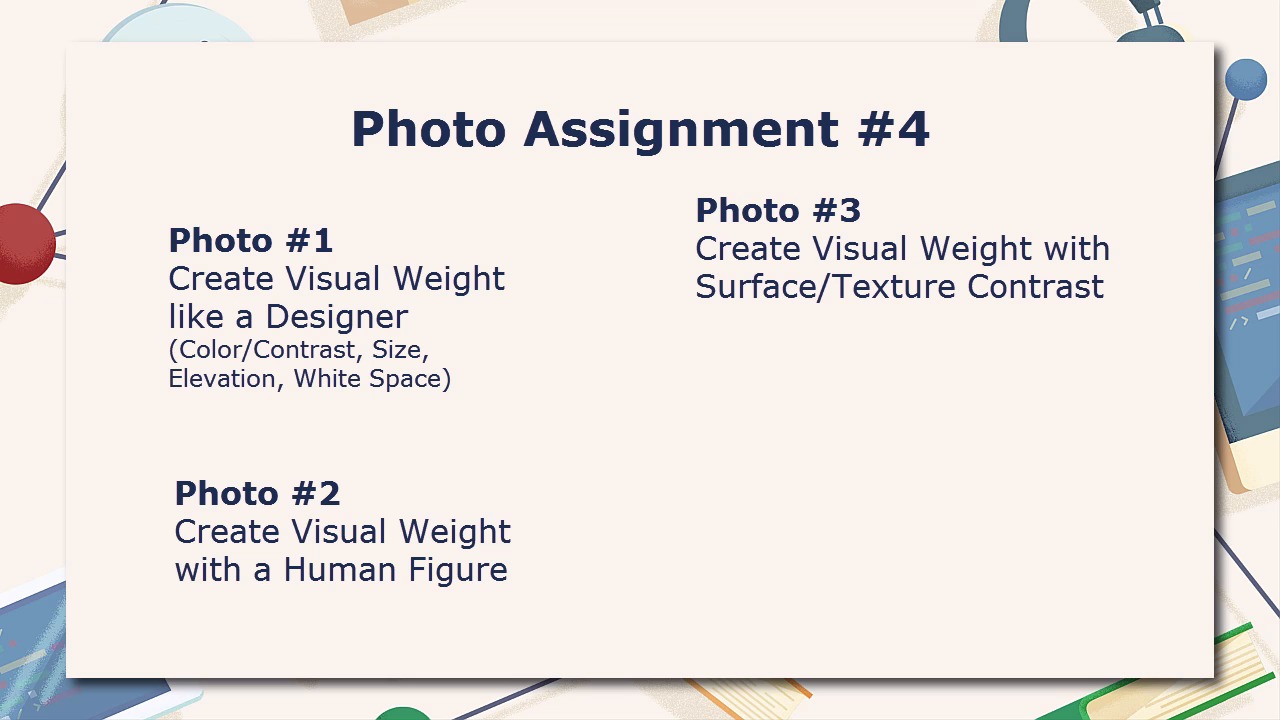
- Overview
- Transcript
5.3 Photo Assignment for Visual Weight
This is the last assignment of the course, and it will challenge you to find various examples of visual weight in your photos. Once again, be sure to grab the handout before you start.
1.Introduction
1.1Introduction02:46
2.Lines
2.1Lines in Design03:07
2.2Lines in Photography05:00
2.3Photo Assignment for Line02:45
2.4Lines Photo Evaluation09:20
3.Shape
3.1Shape in Design03:02
3.2Shape in Photography04:15
3.3Photo Assignment for Shape01:37
3.4Shape Photo Evaluation07:48
4.Color Theory
4.1Color Theory in Design03:37
4.2Color Theory in Photography04:27
4.3Photo Assignment for Color01:52
4.4Color Photo Evaluation06:53
5.Visual Weight
5.1Visual Weight in Design05:05
5.2Visual Weight in Photography04:30
5.3Photo Assignment for Visual Weight01:40
5.4Visual Weight Photo Evaluation07:23
6.Conclusion
6.1Conclusion01:17
5.3 Photo Assignment for Visual Weight
Hello everybody and welcome back to Basic Design Concepts for Photographers. This is lesson 5.4 where we take a look at the photo assignment for visual weight. In this photo assignment, the first photo that I want you to try to find is one that creates a composition containing visual weight that uses at least one or more of the elements frequently used in design, such as contrasting colors, size, elevation, or white space. The second photo I'd like you to try to find is one that creates visual weight through the use of a human figure, and or faces and eyes. This could be as simple as a human silhouette in an otherwise lonesome setting, or possibly a face in a crowd that is making eye contact with the camera. The third photo in the assignment is a photo that creates visual weight by use of contrast in surface or texture. There's a lot of leeway in this one as far as the interpretation of what surface or texture means, and how to see the contrast in it. And to be honest, it's rather rare to find something that fits this that doesn't also fit into one of the other categories as well. The fourth photo I'd like you to find is one that creates visual weight by the use of text. Try to find an interesting application for this. Avoid the temptation to simply go out and take a picture of a stop sign. Try to find something that's a little more interesting and creative. The fifth and final photo of the assignment is to compose a shot that creates visual weight by the use of depth of field. It's one of those tools that photographers can make great use of. The Illustrators and Graphic Designers wish were quite so easy in their fields. Then in lesson 5.5, we'll take a look at the result of some these assignments and how we might improve them in Photoshop.


