
 Lessons: 11Length: 55 minutes
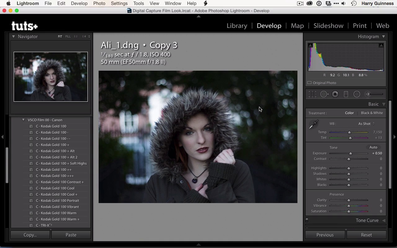
- Overview
- Transcript
2.2 Bring the Image to Neutral
Images straight out of the camera are not neutral. At the least, you'll need to correct the white balance and exposure before you start adjusting the look. In this lesson you'll learn how to create a neutral exposure and work from a solid base.
1.Introduction
1.1Introduction01:29
1.2What You'll Need02:26
1.3The Kodak Gold 100 Look04:41
1.4Intention and Consistency04:30
2.Lightroom, VSCO and Emulation
2.1Assess the Image04:33
2.2Bring the Image to Neutral05:54
2.3Apply the Preset05:26
2.4Local Adjustments12:30
2.5Finishing Off08:16
2.6Consistency in Lightroom03:10
3.Conclusion
3.1Conclusion01:51
2.2 Bring the Image to Neutral
Hi and welcome back, i n the previous movie, we made all these very attractive notes all over this picture. So I had some idea of what I was gonna do. In this movie, we're going to ignore all these notes. I'm gonna bring the picture to a much more neutral exposure down in the image bar there. You can see that I've got this which is the edit with all the notes and then I've got the original file here. I wanna keep the original file so we can compare it to the baseline. So I'm gonna be working from a virtual copy. So I'm gonna right click there and then select Create Virtual Copy. Working with virtual copies is one of the best things about Lightroom. You can easily have multiple versions and multiple edits of the same file and it constitutes very little in the way of extra disc space. So, it's a really great thing to do and it's something I really recommend you do. Every time you're working with an image. Anytime you're making some major changes that you aren't sure about, just use a virtual copy. If you don't like the changes, then you can just go back to the previous version. The first thing to do when editing an image is to bring it to a neutral exposure. As I mentioned in the previous movie, this image is quite under-exposed, so I need to have a look at what data I have in the shadows. To do that, I'm gonna use the sliders in the basics funnel, and I'm going to use the histograph up here to try and get something that's exposed much more to the middle. It's going to look absolutely awful but once we start to edit the image properly and then we'll begin to make it look good. First though we just need to see what we're working with. First thing, I'm just going to work from the exposure slider. I know that I'm going to need to Drag it up a little bit, so let's increase that by half a stop. And we can already start to see the data coming back into the shadows. And because these are blown out, they're bulky, there's not too much texture in there. The big thing I've gotta watch for is just the noise levels. It was shot with ISO 400 for 100, a reasonably moderate camera. So it's something I've got to be too worried about unless I was trying to really brighten it up. I'll show you what I mean, if I brighten it up all the way, now we start to really get some noise into the shadows there. But that's two and a half stops. So I've really got quite a lot of information in this image to work with, a lot more than you´d think I´d have, just by looking at the histogram, or looking at the image as I opened it first. Now, it is heavily scued towards the shadows, a lot of the highlights and whites are in Ali's face, although there's some in the white in the background here, and in the bulky over here. I really want to make sure to keep Ali's face from blowing out, so I'm gonna pull the highlights back. And you can see some fairly ovally texture introduced, but that's not something to worry about yet. And then really pump up the shadows, and get that data back in there and see all the texture we're getting back into the hood here. That's all important, the color in her hair, you can see I've really pulled the shadows up to 87. We're losing our actual black point, but that's not a problem. That's something we can introduce again, at the end of the edit if we want to with just a simple adjustment to contrast. Again, we've sort of lost the white points. I think I'm gonna pull in the whites as well because the brightest values, is it effecting it, no, it's not really effecting it. You can always move a slider up and down the whole way to see what it's really effecting, and that will give you an idea of how much you want to tweak it. I'm gonna pull it down a bit, it's effecting some of the values in her skin, not a huge amount. Now we'll look at the black value, and again, it's effecting deeper shadows. So, I think pulling it up a little bit wouldn't do this any harm as a base exposure. Now it's time to address the color balance, a lot of people like to do the white balance first. I tend to do some of these exposure adjustments and then revisit, the color balance, things like blue can darken your image or at least make your image appear darker so your always going to be tweaking it as you go. Good place to start with is the As Shot especially if your working with In auto mode, you can also have a look at what Lightroom thinks it should be, by clicking on auto. And you can see that Lightroom has pushed that quite a bit to the magenta rather than the green. Let's have a look, plus 20, yeah so it's warmed it up and pushed more magenta into the tint. I don't feel it needs more magenta, but I think it could do with being warmed up a little. So not too much somewhere around there is where I would feel that the white balance is sort of neutral for this scene. All these hair and skin tones are fairly natural and there's nothing to color casting about the image. I can push the backslash key to have a look at the before, and as you can see, we've come a long way here. And this is, well, actually an uglier image and certainly a less visually striking image a far better exposure. This will give us an idea, along with the plan, of what we need to do to the image. In the next movie, I'm gonna do just that, I'm gonna apply the preset and start editing the look and feel of the image so that we can emulate the Kodak gold film.


