
 Lessons: 11Length: 55 minutes
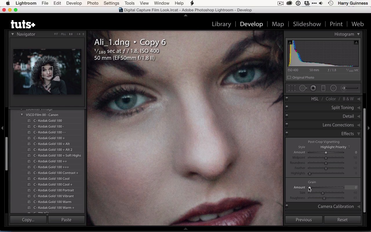
- Overview
- Transcript
2.5 Finishing Off
Almost done! In this lesson you'll learn how to apply finishing touches to the image.
1.Introduction
1.1Introduction01:29
1.2What You'll Need02:26
1.3The Kodak Gold 100 Look04:41
1.4Intention and Consistency04:30
2.Lightroom, VSCO and Emulation
2.1Assess the Image04:33
2.2Bring the Image to Neutral05:54
2.3Apply the Preset05:26
2.4Local Adjustments12:30
2.5Finishing Off08:16
2.6Consistency in Lightroom03:10
3.Conclusion
3.1Conclusion01:51
2.5 Finishing Off
Hi and welcome back. We're going to pick up where we left off in the last movie and just finish off this image. To take you back through what I've done. I applied the Kodak Gold 100 preset then we did the local adjustments. So now all that remains is to add in the vignette a little bit and possibly brighten up and do any finalizing of the global adjustments. So I'm going to create another virtual copy, so we can step back through everything at the end, but you don't have to do this. In fact, I'd recommend you didn't. If you're working with exposure, I'd recommend you see it through to the end. There's a vignette tool in Lightroom but it's not the best. What was added into Lightroom 5 I believe was the circular gradient tool, which is a far better way to add a vignette to your image. It gives you a lot more control. So you can see that you get the exact same sliders you get with the brush tool. Now I'm gonna want to darken the image, so I'm gonna pull that back to about -60 will do. We can always tweak this as we go. Feather's the important one. You wanna have that all the way up to about 100, or at least to about 80. By default, Lightroom often leaves that down at zero, which I'll show you now, gives you a very very strange effect. You get this actual circle of brightness, and it doesn't look right at all. Instead, you want to make sure you bring that up to 100 or 80 so that you've got a nice, soft gradient. So I'm gonna just make this big, fatter circle like that, and then reposition it so that the center is on Ali's face. The feathering goes on into the inside right into the center. So, it's important not to assume that the fettering ends on the edge there. So, you're going to be doing a big, big circle. You can see there that the It really is only the center that is not affected by this. I think that the amount of 60 might be a bit too much, we're losing a little bit of texture we don't wanna lose, so maybe somewhere around minus third of a stop is gonna be a little bit better. Yeah, so that's, that's looking good. That's really giving a nice bit of focus on the center. I also want to brighten both the center of the vignette. So to do that I'm gonna grab a new circular gradient. And this time gonna click on invert mask and then do the reverse effect. So go up maybe a third of a stop and then I'm going to paint this, and then reposition it so that it is on the center of the image. I'm going to push H to hide them, to really see the effect they're having. Yeah, I think I'm happy with that. Turn off and on, and you can see that that's really giving a nice little bit of pop. I'm just gonna pull that down. Yeah, it's still selected. Down maybe to about 20. 20's perfect, I think, for this. I can see that that is brightening up her face a little bit. Gonna make that circle a little bit bigger. There's a bit too much feather going on and effect down a little bit more. There. Turn it off. Yeah, that having a nice vignette, I'm happy with that. I don't think its killing too much detail in the shadows. We've got all this nice texture in the hood, in her face, everything. Looks good, so I'm gonna close out of that. And then I'm gonna go down, I'm gonna have a look at the Effects panel. This is where you can apply a vignette in Lightroom. We're also gonna have a look at the grain. I want some grain in this image, and at the moment there's none so I'm gonna zoom in so we can actually see the affect we're having. So around here, and then I'm just gonna start to pull back in the gray end slider and increase the amount. If I go all the way up to 100 it's gonna look horrendously ugly, but I don't want too much. Maybe about 30, I think looks quite good. Size of 40, just play around with the sliders, get a feel over them. Smaller grain, larger grain. I think I'd err towards the smaller side. Rougher smaller grain I sort of prefer but again you can just play with the sliders see what works for you. That's a bit to much, maybe around where it was at the start, around 41. I think I like that effect, turn it off and see how it looks. We'll turn it back on, yeah I quite like that. One of the interesting side effects of grain is that it actually increases the apparent sharpness of images, a little bit of noise makes your eyes pick things out better in a strange way. If you look at her eyes they're. Once I turn off the the effect, you can see that they look a little bit softer but once I add the gray back in they just appear that little bit sharper. So I'm just gonna zoom back out, it's difficult to see grain once you're zoomed fully out. So, it's important to zoom in and I've looked to do that properly. Then I'm just gonna go and do a little bit of sharpening before we export out this image. I'm just gonna down to detail. I'm just gonna go, I know what I want, which is, about 25. A radius of 1.0 and a detail 25. This is the standard Lightroom sharpening. And I think this is going to have the effect I'm looking for. Just turn off, on. Yeah, just a little subtle bit of sharpening. You might not be able to see it on your screen. You'll be viewing this at 720p. I'm while I'm recording this at 720p, I'm never quite sure how much data on the subtle detail makes it out of the screen capture program. So let's recap what we've done here, and then save this image out. I go all the way back, we'll get to my plan. So there we go. I got the early plan. I did add the add the vignette, to make sure we keep the texture, darken the hand. Do a lot of dodging and burning, bring out her eyes, clean up those blemishes. I think we've stuck pretty well to this plan, one or two things may have changed, but I really don't think so. Then this is our original image, then we made a neutral exposure. It goes in the idea of what data we are working with. For us editing this image in Photoshop this is actually the exposure I would send over to Photoshop to edit. And then we apply the Kodak Gold 100, double minus. Presets, tweaked it a little bit, did our local adjustments, brought out Ali's eyes and face and all that, clean up some blemishes. Then we did the vignette, the sharpening, and all that, which has really brought this image out. I think this is really quite a nice shot, and really quite nice effect. That's a really good emulation of the Kodak Gold look. It's really important with this sort of thing, not to use the preset as a final product. You can see that if we go back to just when we applied the preset. We, you know, the other factors. It's okay, but it's, subtle is nice but once we go in and make these local adjustments and add in things like a bit of grain and the vignette, we really make the image look the way it should. To finish it out, just go to File and then Export and then you can export this as whatever you want to call it. So let's go with Kodak 100 and then we'll just click Export and then we've got this image saved as a jpeg, ready to be shared anywhere you wanted. Check back in the next movie and we're gonna have a look at some other images that have been treated in the same way.


