
 Lessons: 18Length: 1.8 hours
- Overview
- Transcript
3.1 Essentials of Image Correction
All digital images need correction. In this lesson, we'll walk through most of the Develop module's panels to learn how to adjust exposure, color, and a variety of other tools to perfect your images.
1.Consolidate and Import
1.1Introduction01:00
1.2The Ideal Configuration03:05
1.3Import Your Images11:00
1.4Customize Lightroom's Appearance09:17
1.5A Flexible Workflow06:35
2.Manage Your Collection
2.1Collections and Culling10:18
2.2Star Ratings and Color Labels04:31
2.3Keyword Tagging05:39
2.4People Tags02:56
2.5Find and Filter04:07
3.Correct and Perfect
3.1Essentials of Image Correction06:45
3.2Image Adjustment10:02
3.3Correct Your Crop04:15
3.4Batch Processes Made Easy06:13
3.5Photomerge: HDR and Panorama04:43
3.6Spot Correction08:43
4.Out of Lightroom
4.1Concluding the Edit05:43
5.A Holistic Workflow
5.1Make Lightroom Work for You04:06
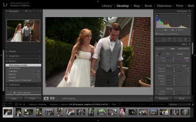
3.1 Essentials of Image Correction
Up until now, we've spent most of our time working with managing our image library. Now, we're changing course to focus on getting the most out of our images. When we import our images, we might notice they lack the finish that we may by envisioning for them. We have a clear vision for what want in our finished product, but we need to use the tools that Lightroom's Develop module offers to get them there. In the Correct and Adjust section of this course, we'll talk about fine tuning the aesthetic of our images. We'll learn to correct and adjust exposure, color, and the presence of our images. We'll even learn about the fine tune, local adjustments that Lightroom offers. Up until now, we've been working in the Library module on our images. Getting metadata added and understanding how to build out our collection as it grows. Now, we're gonna move to the Develop module and work a little bit on editing and correcting our images. We're gonna apply some of the quick fixes and editing tricks that help make your images look much better and work through some of the edit options that Lightroom offers. To get started in the Develop module, simply click Develop from the list of modules, or press D on your keyboard. Now, as we've been talking about all along, the list of panels in Lightroom varies from one module to the next. The panels that are in the Develop module are designed to help you correct and alter the visual appearance of your images. And you'll see what I mean as we progress through. On the left side we have the same Navigator panel that's present in the Library module that we can use to move around and navigate the image. We also have the Presets panel, which allows us to create one-click edit settings for our images. We'll talk more about that a little later. We have also have Snapshots that will allow us to freeze our edit process at any stage so that we can jump back to it. History shows us the edit stages that we make to our images and also allows us to jump back to any given edit stage. The collections panel is a carryover from the Library module as well, and we can use this to select the images we want to work with. The middle panel in the Develop module is always dedicated to showing a single image or a side-by-side Before and After view. The Before and After view has a number of different settings for how we can view our images. If I press y on my keyboard, we enter into the default view of Before and After. If I make changes, you can see here that it shows only on the right and not on the left. We can also view Before and After in a split image. If we click the dropdown on the toolbar option and choose Before/After Left/Right Split, you basically halve the image. To leave the before and after view, press Y again on your keyboard. On the right side are the options that are really specific to the Develop module. We have the histogram, which shows us how the exposure is captured. And we can actually click and drag various parts of that image to control different settings. Below the histogram, are the various spot retouch options, which we'll talk a little bit more about later. Let's go ahead and get started on some the correction options that are offered in Lightroom. I've made a couple of tweaks here already so far so that we can click Reset to bring our image back to the beginning stage. The Basic panel are the options that I think of mainly as corrective tools. They're the type of settings you'll use at the start of your edit to help you get your exposure and white balance and things of this sort right. White balance, as you probably already know, is a tool that basically correct the color treatment of your image. One handy feature that Lightroom offers is this white balanced offer that allows us to set a target a neutral. If I click on a white that's somewhere in the image, it will correct white balance on Lightroom's best guess. It's not always right, and in fact I'll pull the temperature back a little bit. So basically there's two ways to set white balance. You can either use the eye dropper to create your starting point or you can use the temperature intent sliders in order to correct your image. Now, the point of this section of the lesson is all about encouraging you to experiment and work with these sliders in a way that suits your images. I really want to inspire you to spend time experimenting with all of the sliders on your images, so that you can find out how they affect it. But I will take you through briefly about how each one kind of impacts the images. Let's choose another image to work with. And I'll go ahead and reset it. Now exposure is a slider that you probably already know. And I like to think of it as kind of the high-level adjustment to the overall lighting of the image. Pulling it to left a little bit, it's gonna decrease the exposure. And pulling it up is gonna increase the exposure. The contrast slider kinda increases the contrast between the lights and darks in the image. And pulling back on it decreases it and pulling it to the right increases the contrast. Again, none of these things are rocket science, and they'll vary about how you apply them to your images. But it's a good idea to have a basic understanding of how they work. Now, below those two really basic settings are some more advanced settings that allow you to control exposure. And they are the highlights, shadows, whites, and black sliders. And these sliders are really beyond what I can describe to you. Again, there's something that you really have to get an intrinsic feel for as you work through your images. But with the highlight slider, for example, if we pull it to the left, you can see some of the detail coming back in the highlights. Watch in the upper-left part of the frame as I pull it back, you get some detail back in the sky. So while the exposure and contrast sliders are kinda overall tweaks for the images, the highlight shadows whites and black are more refined sliders for each individual part of the exposure range, as I like to think of it. Now, one of my favorite things to do when I'm working through an edit is to turn clipping previews on. And if I click this triangle in the upper left-hand corner, we can see the completely black areas. They are the areas where there is no detail. They're not just dark, but there's basically no detail at all. And you can see in the shoes and little bit of the bushes that's the case. It's not necessarily a bad thing, but it is helpful to know about this and the highlights preview so that we don't just have blown out areas of our photos. You can turn the highlights on by pressing the triangle in the upper right hand corner. And if we have any of those sections, they'll be very apparent. If I pull the highlights all the way up you can definitely see what I'm talking about. It basically warns us of an area where there's no image data. It's basically just wide and completely blown out. Definitely a great thing to watch for as you're editing so that you don't lose too much detail. Now, the shadows, whites and black sliders work very similarly to the highlights. If I pull the the shadows up, we get more details. Watch in the subject's pants right here, for example. And pulling them back will definitely bring some darker areas to the shadows. Now the whites are similar to the highlights, except it specifically controls just for the white areas. So, it's really more impactful on this frame for the sky, which is certainly whiter than the dress, for example. The black slider, again similar to the shadows, but really just controls what I think of as the pure blacks. Again, these are sliders that are kinda difficult to describe and really require the time spent inside a Light Room experimenting.


