- Overview
- Transcript
3.2 Image Adjustment
Once your images are corrected, it's time to adjust the look and create the base of you post-production style. In this lesson, you'll learn how to go beyond the exposure controls to perfect the look of your images.
1.Consolidate and Import5 lessons, 30:57
1.1Introduction01:00
1.2The Ideal Configuration03:05
1.3Import Your Images11:00
1.4Customize Lightroom's Appearance09:17
1.5A Flexible Workflow06:35
2.Manage Your Collection5 lessons, 27:31
2.1Collections and Culling10:18
2.2Star Ratings and Color Labels04:31
2.3Keyword Tagging05:39
2.4People Tags02:56
2.5Find and Filter04:07
3.Correct and Perfect6 lessons, 40:41
3.1Essentials of Image Correction06:45
3.2Image Adjustment10:02
3.3Correct Your Crop04:15
3.4Batch Processes Made Easy06:13
3.5Photomerge: HDR and Panorama04:43
3.6Spot Correction08:43
4.Out of Lightroom1 lesson, 05:43
4.1Concluding the Edit05:43
5.A Holistic Workflow1 lesson, 04:06
5.1Make Lightroom Work for You04:06
3.2 Image Adjustment
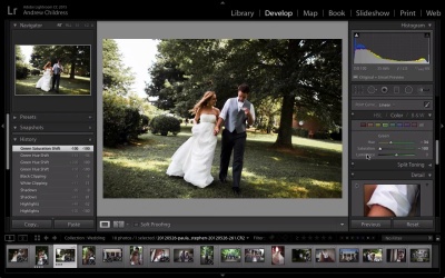
Now, the present sliders are next up on our Basic panel. And they're really cool for bringing out detail or color the way we wanna show it. So, let's take a look at another image about how we can apply it. So, basically what the clarity slider does is it kinda brings a certain presence about the image. It basically brings out some of the finer details, and you'll see what I mean as I drag it. As I pull it a little bit to the right, you can see some of the details here come out in the brick, and some of the bushes down here. So, basically, it kinda conserved and enhanced some of the finer details of an image. You don't necessarily wanna use this really heavily in an image where a person's face is really present. It has a way of kinda applying that awful HDR kinda look. But it is a good starting point for bringing out more detail in some images. And with all of these sliders, it's best if they're used sparingly. I have a tendency sometimes to overdo those when I'm first getting started with an image, and wanna dial it back later. And just as a note, that's one area where a before and after preview can really come in handy. So, let's go ahead and turn that on. I am gonna press Y on my keyboard. And I think that that's probably a pretty good way of bringing out some of the detail on the brick and the bushes in this photo. Let's go ahead and bring the exposure up just a bit. Now the vibrance and saturation sliders are two sliders that help you control the color in the photo. If I pull the vibrance slider to the left, it's gonna bring some of the color out. If I pull it to the right you can really see some of the colors coming out in the bushes and, again, the brick. Now saturation I kinda think of as being overall control over the entire color. So the vibrance I always think of, in my mind, as enhancing the most dominant colors. Whereas the saturation, if we pull it to the left, it's gonna pull all color out. And all the way to the right brings, again, all colors out. So I always think of vibrance as kinda like my slider that I can pull for the important colors and saturation as an overall color control. The last thing I wanna point out is that we can always click black and white here to flip and go to a black and white view on the image. Now, next up is the tone curve, which I do wanna spend just a minute talking about. Because I don't think it's one panel that's very well understood. But it does have a lot of power to it. Let's choose another image. And I'm gonna turn before and after view off by pressing y because I'm just getting started with this. The tone curve is another way that you can really control the highlights, lights, darks, and shadows. So, again, it is kind of similar to the exposure sliders that we've already talked about. But it's just a more refined way of doing it. Let's take a look. If I pull the highlights up, we have kinda that same control over the refined highlights area. The lights, again, similar to the whites. And the darks and shadows are kinda like the blacks and the shadows of the earlier sliders. But one of the coolest tools here is the ability to kinda drag the point curve. So, if I click this icon in the lower right corner, we can start adding some handles to this. And I'll show you what I mean. If I click right here, I get a new point. Let's click right here to add another point. And if I pull this down, I can get that really popular matte look in just a few seconds, kind of a film look. Let's pull the exposure up just a bit. But the tone curve is basically, again, a way that we can add kind of a custom look. And if I pull the bottom up, you can see here we get kind of that same matte look in the shadows. And this a really quick and dirty way of doing it. This doesn't look perfect, but it is a really popular style right now. So I think of the tone curve as another tool in my bag that allows me to precisely control the way I want the image to appear. And I don't use it all the time. Often times I'm satisfied just using the sliders we've already looked at earlier, highlight shadows, whites and blacks. But occasionally, I will pull this trick out for this matte look that I've just shown you. Let's go ahead and reset this image. I'm gonna go back to an image we worked on earlier to work with the HSL and Color panel. Now, first of all, there are a number of different ways to approach this panel. And I always work by clicking on Color at the top, which gives me a lot more control all in the same place. But basically, what this panel allows us to do is really fine color controls. It's all in one place. Let me show you what I mean. So, let's say I don't really like the greens in this photo. I have control over the hue, which is basically kind of the range of colors of that green, the saturation, which is how green I want it to be, and the luminance, which is the lighting of those greens. When I click the green swatch, I get three different sliders that really allow me to precisely control those greens in the photo. Let's take a look. If I pull the greens to the left, for example, I almost get a fall style picture. Pulling it to the right gives it kind of almost a cyan hue. I'm gonna pull it back to the left a little bit as my final point. Now let's take a look at saturation. Let's say I barely want the greens present at all. If I pull it all the way back, then the greens really aren't present at all. This is an amazing tool for refining the way you want your images to appear. I can't say enough about working on the Color panel, because it's just such a precise way of really refining the feel of our image. If we look at the before and after view, I mean there's no comparison about how those greens are portrayed. This is where your vision as an artist really comes to light. Because you have such fine control over the fine details. The last slider is luminance. And if I pull it to the left, the greens take on a really dark tone. And pulling it to the right makes them feel a little more airy in my opinion. So let's talk about just the last few panels, here. Split toning is another way to approach color. Again, we'll pick another image. And what split toning allows you to do is create these split-toned looks that control the colors of the highlights and shadows in your image. For example, if we want the highlights of this image to appear to kinda have a purple tint, we pull the hue over to the purple area right here. And then turn the saturation up. And you can see as I do that, the image has a really weird nostalgic feel about it. But it is a great creative tool if you like really refining the colors. Let's reset that. Now in the shadows, if we want kind of a warm feel, we could move to the oranges just a little bit, and pull the saturation up. So with the Split Tone panel, you have the ability to create these custom, crazy looks. And again, just like the Color panel, this really allows us to set our images apart from someone else's. Try picking some complementary colors from the highlights and shadows, and experimenting with the saturations sliders, to create some crazy, custom looks. Let's talk next about the Detail panel, which as it sounds like, is used for some of the finer details. We'll go back to our images that we've been working on just a bit. And what's important to know about the Detail panel is that you can't always see it in the main area. You're gonna wanna work with it at 100%. And I like using this little box here to see how my adjustments are affecting the image. I'm gonna go ahead and click this box right here. And then point it to where I want the preview to be. When I'm working with people photos, I really like setting that to a person's face, because it's so easy to overdo the sharpening. And before long their faces just don't look natural. So the takeaway here is to set this to a part of the image that matters. And then experiment with the sliders down here. So, we all probably know a little bit about sharpening. Basically it's a way to bring out those finer details. Oftentimes, I'll just pull the sharpening up just a bit to bring out the details in the image. But I have to say, I'm not big on using sharpening sliders. Now, next up is noise reduction. And if your image has a lot of noise, these can be big lifesavers. For the purpose of this course, I don't think it's necessary to understand what all of these sliders do. And when I'm applying them, I usually just pull luminance up just a little bit. I like this one slider approach to adjusting noise because I think Lightroom does such a great job of it. Let's move now to the Lens Corrections panel which I think is a really cool tool. If I come to an image like this one, I may have a bit of distortion in the image. And you can see here, if you're watching really close, that maybe the lines aren't straight, even though the building hopefully is. [LAUGH] With lens corrections, we can basically correct for the imperfections of our lens. If I go to the Profile tab, which is always where I'll work, and tick the Enable Profile Corrections box, you can see here that Lightroom applies kind of a one-click fix. And I'll toggle it off and on so you can see. It basically straightens those lines out and corrects for the vignetting on the edges. Again, this is a panel that has a lot of power to it, but I like the one-click fix most of the time. And lastly, the Effects panel has some options for applying styles to our images. Let's go back to this image we've been working on all along, and take a minute just to talk about vignetting. Vignetting is the darkening or lightening of edges that you may see used in photos from time to time. Again, with some of these advanced panels, I'm a one slider kinda guy. I like pulling just a little bit to the left to darken the edges. And if the image is already too dark around the edges, I might pull just a little bit to the right to lighten it up. You can spend a long time experimenting with these sliders, but in my experience, I like pulling it just a little bit to the left for just that minor darkening of the edges. Doing that sometimes will kind of direct the viewer's eye to the center of the frame, where your subject may be. Now lastly, if you'd like to give it kind of a grain look, you can slide the amount up just a little bit for that old-school film look. And again, this is another slider that I think it's really important to zoom in and work at 100%. Because if you're not careful, you can drag it up too far really quick and the image feels grainy. It's not as apparent when you're zoomed out. But it's very apparent when you export. So, my tip here is that if you wanna experiment with the grain slider, just make sure you're zoomed in on a part of the image that matters. So this is kinda it. Pretty quickly, we covered a lot of the key sliders in the Develop module that help you shape your vision as a photographer. And I hope the key takeaway here is that you have the tools that you need to execute on your creative vision. One of the best things about the digital workflow is that you start with the beginning image, and polish it into this amazing finished product. And Lightroom has a ton of tools to do that.


