- Overview
- Transcript
5.1 Color Correct and Grade
In this lesson you will learn about your options to adjust and perfect the look of your video.
Related Links
1.Introduction2 lessons, 06:13
1.1Introduction01:10
1.2What You Need05:03
2.Getting Started3 lessons, 29:02
2.1File Structure09:39
2.2A Quick Tour of HitFilm09:30
2.3Import and Organize09:53
3.Set Up Your Project2 lessons, 19:14
3.1Proxies and Transcoding09:24
3.2What Is Video Editing?09:50
4.Editing Basics6 lessons, 57:46
4.1The First Cuts Are the Deepest10:02
4.2Add Clips to the Timeline07:37
4.3Refine the Edit, Part 110:20
4.4Refine the Edit, Part 208:51
4.5Add a Cutaway Shot08:19
4.6Build on the Basic Edit12:37
5.After the Edit5 lessons, 40:16
5.1Color Correct and Grade09:39
5.2Sweeten the Audio08:03
5.3Video Effects and Transitions08:53
5.4Export04:35
5.5Compression09:06
6.Conclusion1 lesson, 01:08
6.1Conclusion01:08
5.1 Color Correct and Grade
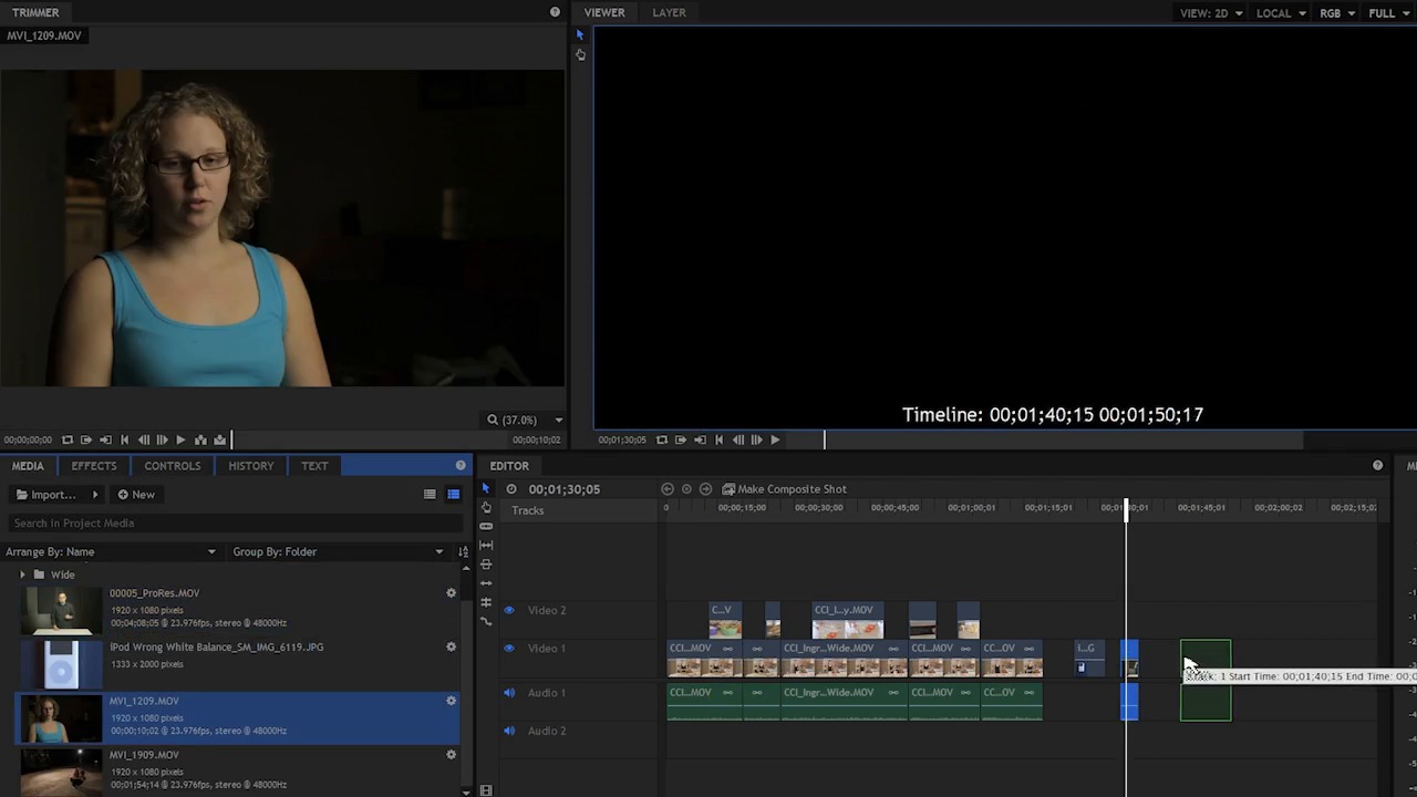
In this lesson, you will learn about your options to adjust and perfect the look of your video. Color correction and color grading, both are somewhat similar, in that they modify the look of your Picture, but they're not exactly the same. Color correction is a process where every clip is adjusted to get a good exposure, a good balance of light, and to make sure that the colors are somewhat neutralized. So this could be something like adjusting the color temperature. It could be adjusting for a particular color cast of a light or a color reflection. For example, some lower quality fluorescents and lower quality LEDs will have a particular color cast to the light. Often that shows up as green on camera, and that needs to be adjusted, because green skin is not very attractive. So color correction is the process where that is taken care of. Color grading is more of a creative process, where you make a decision to give your picture a particular look that has maybe a stylized kind of feel to it. Color grading is where you start pushing things away from the strictly natural or accurate colors, for example, in some period war movies like Saving Private Ryan. The colors are very muted, it's almost a desaturated kind of green muddy look to it. There's not a lot of vibrant colors. Action movies for example, are very bright and very poppy. You have kind of a blue and orange kind of color palette, where the skintones are bright poppy orange and the shadows are tinted a little towards blue. So let me show you a few things here in HitFilm. I've added a few more clips here to this project just for illustration, and I wanna bring those out and just show you what I am talking about. So the first one here, this is actually just a still of an iPod. Now this does not look quite right because the color of the iPod looks blue. I can fix this with some color correction. I'm gonna jump over here to the effects and come down to color correction. And there are many, many options to fix this sort of problem here. What this looks like to me is the white balance is set wrong on my camera. So I can simply choose a white balance effect, and I'll drop that on my footage here. And then I'll come down, and there's actually a color picker which kind of looks like a little eyedropper here. And what I can do with this is very easily pick something that's neutral. Neutral is anything white, black, or gray.. Usually gray is the best choice, but depending on your scene, you're gonna have to go with whatever works the best. If I just click this without releasing the mouse button, and I hover over the white, you can see that the blue is much stronger than the red and the green which is why this image looks blue. If I hovered over the black you can see that it's even more so red and green are pretty close at 36 and 38. But blue is 52 so, what you can do with this simple white balance effect is, just pick a color here that's supposed to be neutral. Let me try grey here in the middle. Yeah, that looks pretty close. So let's look at another example. This is a clip shot with some flourescent lights,and these are fairly high quality flourescent lights. They have a good color quality but, for whatever reason, sometimes the color can look different on different cameras. So on this particular camera it looks just a hair green. You can see my shirt is supposed to be black and it looks just ever so slightly green. So I can drop a color wheels on here and try and take the mid-tones and just push those a little magenta. Now if I go too far, whoa, that's obviously not the right thing. But you can see that this looks too green, and then as I slide this over, there's a point where things look better, and then they look worse. So somewhere in the middle, I think, looks good. Now you can see if I click this off, definitely too green, right? And right here, things are looking better. So sometimes it can be just as simple as that. You have footage that's a little green, cuz they're kinda cheap lights, it's a pretty simple fix here in post-production. Now that's never going to be as good as using really good quality lighting. But it does help because you can't control the lights all the time. Same thing with this footage here, this to me looks a little green. It also looks, perhaps, a little dark. So, another thing that we could do here is, I could drop a colored corrections on, just push this a hair magenta and it's really not too much, but it does look just a tiny bit green, right? And also, I'd probably look for an exposure adjustment here. Drop an exposure adjustment on here and bump this up just a little bit, maybe a half a stop, maybe 0.3 of the stop. You can see on, off, it really kind of brings things up quite a bit. Now let's look at color grading. So I'm gonna grab this clip here of my buddy DeVille. He is an action actor. He does all the martial arts and the stunt coordination type stuff. And so this is a little clip of him doing some sweet looking martial arts here. Got all the muscles and all that good stuff. So this clip is white balanced correctly. There's probably not a heck of a lot that I have to do for color correction, because the white balance looks right, the skin tones look right, the colors look right, but perhaps it looks a little dark, so I may bump this up with a little exposure adjustment. But what about color grading? If I come down here, we have another folder in HitFilm and it's called color grading. And in here there are several presets and some individual effects. I could grab something like CineStyle, and watch what happens when I this on. Woah, instant action movie right? We have this high contrast look, we have this 2.35 to one aspect ratio. It's kind of that super CinemaScope look. And in the effect here, we have control over all of this stuff. So I can roll back the contrast. I can pull back this color adjustment. It also has exposure and saturation in here as well. There is this letterboxing here. There's some grain, which is probably hard to see, and there's also a vignette. So this is where you can really start to use your creativity to push things around. It can be something as simple as, if you have a shot that's outside and you want to make it look cold you push the colors towards blue. If you have a shot on the beach and you want to make it look more warm and it was actually shot on an overcast day, you could push the colors a little bit more towards yellow and orange. There's a lot of option there and you can use whatever you need to use to enhance your story and enhance the look of your video. Now what would you do for real life footage? Things that are not kind of action movie stuff. Well, let me show you just a few clips that I see in the sequence already that maybe need to be adjusted. This one, for example, is too bright, so what I would do here is grab an exposure, and drop that on here, and just pull the exposure back just a little bit here. And I pull the offset down. So, something just as simple as that, maybe this shot right here. I would, bring the exposure up, a little bit. A notch or two, to match the rest of the shot, cuz, that particular shot looks a little bit lifeless. For the rest of this footage the coloring looks okay. If I was to anything I would probably drop a color correction wheel on here. And just maybe push the shadows down to this kind of cyan color just a little bit. I wouldn't overdo it. This doesn't need to look like an action movie. But having the shadows tinted a little bit cyan will help to give this a little more color contrast. I might take a curves adjustment and drop that on here. And then just maybe give this just a tiny bit more contrast by pulling the shadows down just a hair. I don't want to overdo it because I think it already looks pretty good, but just a little more contrast might make this look a little bit more poppy. Maybe I would add a tiny bit of, maybe a vignette expose. Maybe just a hair, something so subtle that you may not even notice that it was there. And probably, I would add just a little bit of grain to this is as well. Maybe film grain. But I would pull it way back, so you could barely tell it was there. So now that you understand the basics of color correction and color grading, you're ready to move on to the next lesson where you're going to learn about sweetening the audio


