
 Lessons: 22Length: 3.6 hours
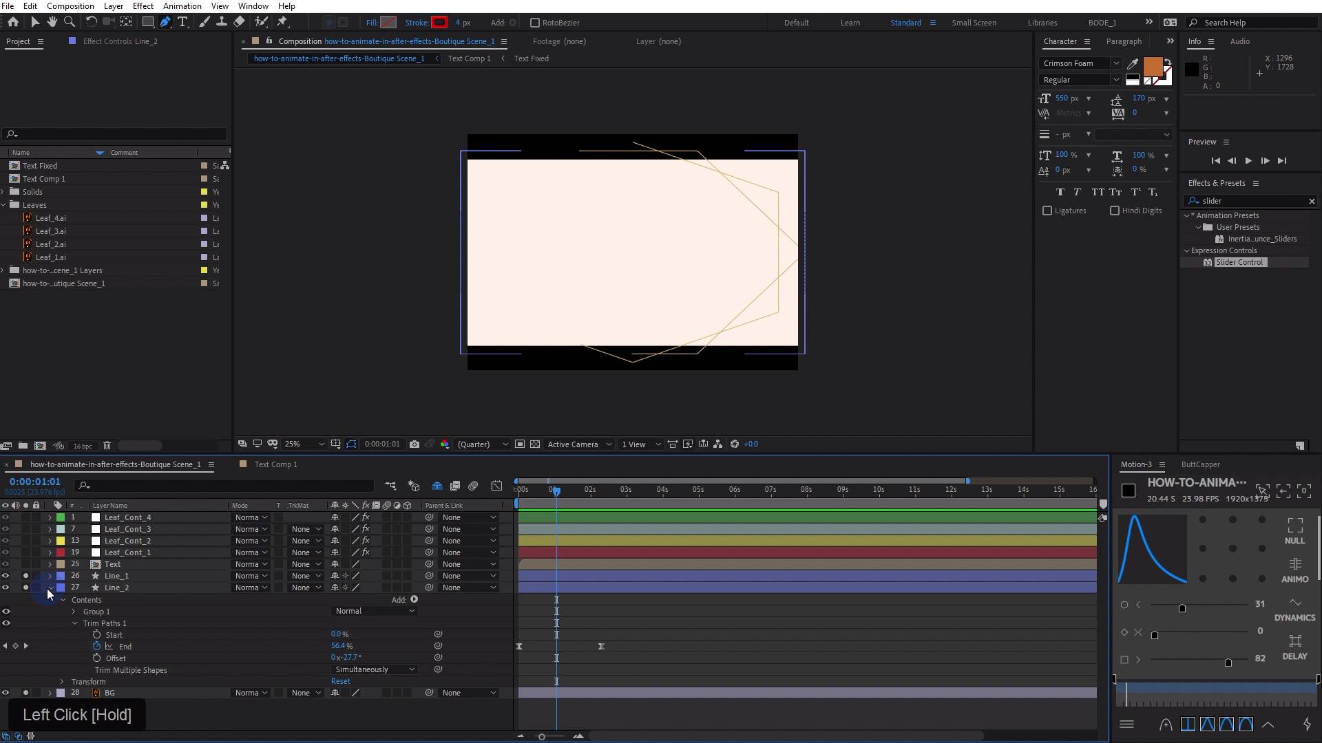
- Overview
- Transcript
5.7 Boutique Text: Final Touches
In this lesson, you will learn how to put some final touches on the Boutique design animation to put it all together.
Related Links
1.Introduction
1.1Introduction02:55
2.Basics
2.1Keyframe Basics14:03
2.2Reveal Text With Masks and Shape Layers12:08
2.3Basic Text Box Reveal08:57
2.4Bounding Box Reveal11:48
2.5Text Reveal Rectangles: Part 113:02
2.6Text Reveal Rectangles: Part 208:44
3.Burger Logo Reveal
3.1Burger Logo: Prepare the Artwork11:54
3.2Burger Logo: Animate the Layers11:04
3.3Burger Logo: Final Touches10:46
4.Outer Space Intro
4.1Outer Space: Animate With CC Lens09:53
4.2Outer Space: Animating Strokes & Glow Effects13:42
4.3Outer Space: Lens Flares08:44
4.4Outer Space: Noise & Grain12:14
5.Boutique Text Effect
5.1Boutique Text: Prepare the Artwork06:59
5.2Boutique Text: Create the Layout06:14
5.3Boutique Text: Inertial Bounce Expression11:20
5.4Boutique Text: Wiggle Expression06:06
5.5Boutique Text: Layer Control06:07
5.6Boutique Text: Handwritten Text13:07
5.7Boutique Text: Final Touches11:38
6.Conclusion
6.1Conclusion02:09
5.7 Boutique Text: Final Touches
[MUSIC] In this lesson, you're gonna learn how to put some final touches on this animation and bring it all together [MUSIC] So let's check out one more time what we have here. I think this is awesome looking. The way that the leaves come on and they kind of move very subtly. That's looking great. I love the right on effect. It's just elegant looking. One thing that I'm gonna do to clean up my composition here is I'm going to select my leaf layers and I'm going to hit the shy switch on them. And I'm gonna hit the shy guy up here and just hide them because I don't really need to see all of those. It's not deleting them, it's just hiding them. You can see it kind of changes the way the interface looks. We have kind of this thicker line right in this region right here, and that's letting me know that there's something hidden between these layers. If I want to bring them back, I can just hit the shy guy again, or the shy switch, and they'll all appear but this makes it a little bit cleaner to work in. So there are a few final touches that I wanna add. One, is I want to anime on these lines. And right now they are an Illustrator file in here, but I think if we right click on this and choose Create and create shapes from vector, they'll just be transformed into a shape layer. And what's nice about that is we can dive into this lines to outlines layer and I'll just rename that and add a trim path, and set a keyframe here for the end, maybe somewhere around, I don't know. Maybe two and a half seconds, something like that. We'll go back to the beginning set this to 0. So I'm going to select line 1, and I'm gonna do the same thing, right-click, choose Create > Create shapes from vector layer, and I don't need these anymore, so I'm gonna get rid of those. And then I can essentially just take this trim paths and paste it over here. Let's just see where that paste it in. Great, it's right there. And I think that's fine. Just gonna rename this. It's just kind of a personal peeve of mine that when you create a shape layer from an Illustrator file, it puts the outlines tag on the end of the layer. And that drives me nuts. I do not like to see that. So I like to rename my layers there. You can do that or not, no big deal. I'm gonna select my two line layers here, press U on the keyboard and I'm gonna select my key frames. I'm just gonna hit F9 on the keyboard. I'm gonna jump into the graph entered here. I'm just going to give these a little bit of a curve, something like that. Let's see what that looks like. In fact, let's just solo the bottom three layers, so the two line layers in the background layers. So we can see what this is looking like. Okay, not too bad. Not too bad. It's not great though. I don't like that they're going in the same direction. So that's an easy fix. I'm just going to select the path. So we'll drill down here in line 1 under Contents, under Group 1, under Path. And then we can just hit this button to the right here which will reverse the path direction. So let me deselect everything and play that again. Yes, much better. And I think both of these shapes here have points. Yeah, they're kind of a squished hexagon. At least that one is, let's look at this one. What do we have here? This is a hexagon but a more different hexagon. And where the trim paths kind of start and finish we can control one way to control that is to grab the pen tool. I'll just Ctrl click in here to deselect all of the points and then just click on the point that I want to modify, or right-click on that point. And then go down to mask and shape path and choose set first vertex, which basically means that this point here, this vertex is going to be the first one in the group. And so that's the one if we unsolo the other layer. That's the one where the animation is going to start from. Okay, why can't I see that? [LAUGH] I see the line is so small that actually couldn't see it, so there it is. You can see that now the animation is starting from that point it's hard to see it because the stroke is so small there. But if I deselect, you can see that that is happening indeed. Now the other shape layer here does not have a point right down at the bottom. So if we wanted to start there, we could add a point and then right click, go to masking shape and set first vertex. And now if we solo up all of these and play it, we're gonna get kind of a mirrored sort of animation, which is nice, that works. The other thing that you can do, I'll delete this vertex here and then let's see where I'm just gonna bump the stroke up because I can't tell where it's. Okay, so right now this is the first vertex. The other thing that you can do with trim paths is you can just change the offset. So if you just click and rotate the offset. We can just move this around. And right now you can't really see it. So we could do is just jack up the height of our comps so we can see everything to find out exactly where you want that to start. There we go. Something like that. That's another way that you could go about doing essentially the same thing. So let me set this back to four. I'll deselect everything and let's just play that. There we go. Let me just solo these three layers. Now maybe we don't want these to go in opposing directions cuz now that I see it, I don't really like it. I think what I would like is them to go in the same direction but to start at the top and the bottom like they are now. So I just change this back to reverse path direction off. And I think I like that better. Yes, I think that's fine. You can do kind of whatever you want. So I'm just going to play this back. We'll get a look at it. I think the final thing that I'd like to do is to give this some dimensionality and we're going to kind of fake a 3d sort of look here. And the way that we do that is to essentially move things in the comp in a Kwazii 3D way to get some parallax effect. So here's what I'm gonna do. I'm gonna take line 2, I'm gonna pair to line 1, then I'm gonna shy line 2 because I don't really need to see it. I'm gonna adjust the scale of line 1, I'm just gonna do a key frame animation here. I'm gonna set a key frame at 0 and then we'll adjust some things. I'm gonna take the text layer and I'm also going to set a key frame here. And then maybe the leaf layers here. What I might do is jump back up into the project panel, grab another null, drop it in the center. Set that to an adjustment layer, and I'll call it leaf master controller. And I will parent all the other leaf controllers to it. And then I can set a scale, key frame on this. And so what I want to do is over time and I might make this animation something like 10 seconds long. So I'm just going to hit end on the keyboard. And that will put the endpoint for the work area right at 10 seconds. And then I just right-click and chose to trim comp to work area. So I might go to let me this point right here and just scale these leaves up a tiny bit maybe by like, I don't know one and a half percent. It's gonna be pretty imperceivable. And then I'm going to move, the other layers here a bit more. Actually, maybe we'll move those up something like, maybe 103 or something like that. Maybe a little bit more because they are actually above the lines in the stacking order. And for the lines, I'm going to maybe make those a little bit less, maybe 101.5. So it's gonna be very subtle I'm not even sure you can tell that they are moving. Maybe I'll make those like, I don't know 105 or something like that. And then maybe 109ish. Let's see how that looks. Yes, I think that is looking quite nice. And then finally, I'm gonna take the text and I'm going to make this move the most of all. So actually, I'm gonna start with the text at perhaps 95 and then I'm gonna go up to maybe one 110. Let's try that. The text may look a little bit fuzzy. What we could do is collapse the layer transformation here or continuously rasterize. And then jump in this comp here and then collapse that. And then also we'll continuously rasterize this. So everything's basically continuously rasterize or the layers are all collapsed. So now it will remain essentially sharp no matter how big you make it, and that's too big. So don't do that. So let's check this out now. Essentially I wanna make the text look like it's in front. So I wanna have that scale the most out of all three of these, which is why I made a scale change of 15 where my leaf master controller is doing about 10 ish, so that's a little bit less and then the lines are going five. So it's a difference of like, five and then another five and then another five, which isn't drastic, but I think it's enough over the course of this animation to give it a 3D sort of effect. It's giving it a parallax effect. And we can kind of boost that even more by making this 90 when it starts. And that will really make it look like it's in front of everything else because things that are closer to you or a camera appear to be moving faster than things that are Further away, that's kind of what the parallax effect is. So you can kind of cheat that by taking a layer that you want to appear as though it is in front in 3D space or closer to the viewer and scaling that up more over time. It's kind of hard to see over maybe ten seconds if I just squish this down. You'll see it. Perhaps a little bit more. I think we could sell this even more by just scaling down the back these lines even less, we can just do like 103 or something like that. It would be very, very subtle. But if we get those to move, almost in perceivably everything else I think is gonna fall into place a little bit more. Yeah, that's looking quite nice I think. Yes, very good. So that about wraps it up for this series of lessons, checking out this boutique style animation with this great looking text that you can find over on Envato Elements. Here's the font that was used and all of the other assets you can find over on Envato Elements as well. Make sure to watch the next lesson, where you're gonna learn some final tips and tricks. [MUSIC]


