
 Lessons: 22Length: 3.6 hours
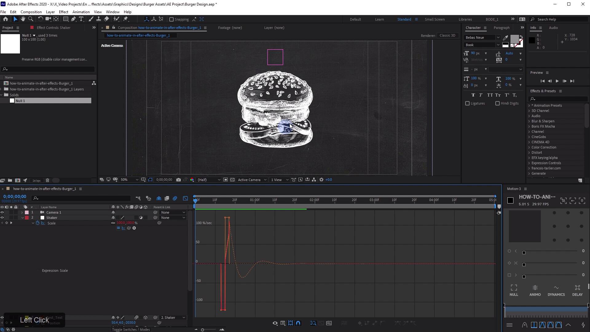
- Overview
- Transcript
3.3 Burger Logo: Final Touches
In this lesson, you will learn how to put some final touches on this logo animation, including using an inertial bounce expression.
Related Links
1.Introduction
1.1Introduction02:55
2.Basics
2.1Keyframe Basics14:03
2.2Reveal Text With Masks and Shape Layers12:08
2.3Basic Text Box Reveal08:57
2.4Bounding Box Reveal11:48
2.5Text Reveal Rectangles: Part 113:02
2.6Text Reveal Rectangles: Part 208:44
3.Burger Logo Reveal
3.1Burger Logo: Prepare the Artwork11:54
3.2Burger Logo: Animate the Layers11:04
3.3Burger Logo: Final Touches10:46
4.Outer Space Intro
4.1Outer Space: Animate With CC Lens09:53
4.2Outer Space: Animating Strokes & Glow Effects13:42
4.3Outer Space: Lens Flares08:44
4.4Outer Space: Noise & Grain12:14
5.Boutique Text Effect
5.1Boutique Text: Prepare the Artwork06:59
5.2Boutique Text: Create the Layout06:14
5.3Boutique Text: Inertial Bounce Expression11:20
5.4Boutique Text: Wiggle Expression06:06
5.5Boutique Text: Layer Control06:07
5.6Boutique Text: Handwritten Text13:07
5.7Boutique Text: Final Touches11:38
6.Conclusion
6.1Conclusion02:09
3.3 Burger Logo: Final Touches
[MUSIC] In this lesson, you're gonna learn how to put some final touches on this animation including using an Inertial bounce expression. [MUSIC] Final touches on this little animation here. What I'm gonna do is drag down another null. Yes I do like using null layers, and I'm going to call this shaker. Gonna make this an adjustment layer just to make it invisible. The effect that I wanna go for here is, I wanna make the text look like it has some weight to it. So when the text kind of hits, so right about here, boom, I want all of these elements to push back in space. And look like they're kind of shaking, kind of like a meteor impact, if you will. It comes down really hard and we get this little after shake, sort of deal going on, even though I have some 3D elements, it really doesn't matter. Because all you need to do is select my burger text the best text, the line, outline. In fact, I can also select the line's map here, the top bun controller, the bottom bun controller. And then I'm gonna take all of those and parent that to this shaker layer. And now what I'm gonna do with the shaker layer is, I'm gonna hit s on the keyboard and bring up scale. And then I'm gonna take my best text here and press u and then I'll reveal any Keyframes that I have placed on the timeline. And right about when the best word hits or maybe a frame after, that maybe right here. I'll go one frame ahead of there and I will put a scale Keyframe on my shaker now. And then I'll go maybe two frames down the timeline and I'll set this to something like 92 something, and then I'll go two frames forward, boom. Now at this point in time, if I hit u on my burger text, that has hit. And so I will return my scale back to 100%. Okay, let's just look at what we have so far, boom. Okay, that looks sort of gross. [LAUGH] I admit that was not very fantastic at all, but I'm gonna show you an expression, hat's gonna make that look really cool. And that expression is called Inertial bounce. Inertial bounce is kind of a way to create a really sort of lifelike motion to your animations and in this particular case, I'm going to give that scale animation, some Inertial bounce. Essentially what it does is it calculates, I think some velocity and then it draws a sine wave and then decays it over time. If all that sounds like neird business, don't worry, just go to Google and type in Inertial bounce after effects. I can almost guarantee you the top result will be Top Five AE Expressions from graymachine.com. All of these are really good expressions. And you should definitely check some of them out, but the one we're concerned with the most is the first one right here Inertial bounce. Just copy this text right here. Just gonna copy that there. And then over an after effects, I'm going to alt click the scale stopwatch and then in this space down here, I'm going to paste that expression. And just by doing that, check out what I have now. Wow, okay, I gonna roll back to the beginning. So what the Inertial bound expressions did, is I'm gonna bring up the graph editor and then down here under scale, I'm going to click this show post expression graph. It's sort of calculating the motion right here and then it creates a sine wave based on a specific frequency, and then that sine wave decays over time. This very much mimics, essentially what all motion does to some extent. Now it's not super smooth right now, and I'm gonna change a few things, but I just wanted to show you what that expression is doing behind the scenes. Now we can change this. If we go into the expression, just gonna make some room here. And I know this is a bunch of techno mumbo jumbo, but the only things we really need to look at are the top three lines. Amp which stands for amplitude, frequency or freq which stands for frequency and decay. What I usually like to do with this expression, is change the frequency from 2 to 1.5. Because I think 2 is just too much, I like these sort of Inertial bounce movements to be a little bit slower. Then I'm gonna turn up the decay, which is going to make it stop moving faster. So I'm gonna turn it up from 2 to let's try 5. You don't need to put 5.0, just 5 is fine. And then let's see the difference in what that's going to do. Okay, and if we look at the graph editor again, you can see that, now what's happening is we have kind of an overshoot, if you will. Where it goes past 100% and then it dips back down to negative scale. And then it comes back up and then it goes back down and then it just kind of settled. So we're getting a little bit less of that, before we were waving way down the timeline here and now it's just kind of boom. And then it just kind of settles out, but let's just watch. What I like about this is it just makes it feel like, that text has some really nice weight to it. Now we can smooth this out a little further by taking this middle Keyframe and easy easing it and now if we look at the expression. You can see that this top part of the expression is just a little bit smoother. And I think that might look a little bit better. It's really gonna be pretty subtle, but let's check it out, boom. Let's watch that one more time. And we can adjust the intensity of that by moving around these Keyframes. So if we want it to be more intense, we're gonna make the last part of this expression. We're just gonna nudge this to basically make it one frame apart, and that's gonna make it just a little bit more impactful. However, that means it's still gonna have the same amount of decay. So making a bigger wave up front, but it's still gonna have the same kind of decay on the back end. And, yeah, if we want it to be even a little less, we can just change this percentage, this scale keyframe here from 92 maybe 95. And that'll just be a little bit more subtle. So Let's check that out. But I think the effect is pretty cool, because it looks like boom, the text comes in and then it just looks like it's kinda exploding there, which I think is pretty cool. If you want even more decay, we'll just turn this up to like seven. Now let's check it out. And now it's just really dampened the expression or the movement. This to me feels like it's in a really good place. If at the beginning this sort of thing bothered you, where we're seeing this layer bleed through the bottom, really easy thing that we can do. By going over to illustrator and if we can find our top bun layer here, we can grab the group selection tool. And we'll just gonna zoom in to the edge here. And if you just click the path, that's closest to the edge, that'll select that. Here, well, let me de-select and then I'll just click that path. You see all that path right there on the outside is selected. I'm gonna copy that, I'lll come back over to after effects. And I'll just create a new shape layer, so new shape layer. And then if I come down here and I just add a path, I should be able to select the path and then just paste that path from Illustrator, right in here. And now, I have that exact shape right here, and to give it some fill, what I would do, is just add a fill right here. And then I can change that color to, kind of this darker color here. And then I'm gonna take this and just kind of align it with the bun layer. Like that, I'm gonna select the layer, hit enter, rename it to top bun fill, and I'm gonna put it below my top bun. Let's see if I can nudge it over and get it right there. I like to try and align those as close as I can, but you may find depending on what you're filling the back with that, that can be a little bit tricky. One thing you can do is just get it close and then come down here and then add an offset paths. And if that is below your paths, what you can do is just set this to minus one. And that's just going to, if I solo, this that's just gonna shrink it up a tiny bit. If I do minus two, you can see it shrinks it up a little bit more. So that way, it's going to live basically between the edge of this path here and this white area here, so I won't have any bleed over. However, I don't think it's really gonna matter for this. And if I wanted to fill this with the background, that's no problem. What I would do is take my background layers right here. And I would pre compose them. So I'm going to hit Ctrl Shift C, and I'll call this BG for background. And I'm gonna duplicate these. Bring them up, just underneath my top bun fill layer, and then hopefully you know where I'm going now. But if not, I'm going to hit F4 on the keyboard to bring up the track Matte options. And I'm gonna set it to, Alpha Matte. And essentially what that is going to do, if we solo this, it's just gonna paint the background in wherever that bun fill layer is. And in order to get this bun fill layer, to follow where my top bun is, I'm going to parent it to my top bun. And so now I have a really nice way to block out all of this junk from my bun layer. So check that out. Everything else is exactly the same, we're just sort of painting out that little kind of overlap. And this is something that we just needed to deal with because the art wasn't exactly what we needed it to be for this animation. But everything else I think is looking pretty nice. [MUSIC] Coming up in the next lesson, you will learn some more great looking techniques for animating some pre-made designs in After Effects. [MUSIC]


